Japanese fonts affect web design in one way more than any other: every character sits in its own full-width square cell, so Japanese pages hold more information per line, need wider line spacing, and ship far heavier files than Latin pages. On top of that, Japanese has no capitals and no italics, so the hierarchy tricks you rely on in English simply do not exist. What is left is weight, size, color and spacing, and you have to use them well.
I have watched this break more Japanese launches than any other single detail. A button sized from the English string “Sign Up” clips アカウント登録. A heading set at 1.6 line height turns into a grey block of strokes. A designer approves a Mincho specimen in Figma, and the shipped page renders Yu Gothic because nobody declared a fallback. None of these are mysteries once you know how the script is built.
This guide covers both halves of the topic: the design decisions Japanese type forces on you, and the engineering decisions that keep the page fast and legible. It is written for designers localizing a Japanese site, developers adding a language switch, and anyone who has ever wondered why their Japanese page weighs 3 MB.
Table of Contents
- 1Why Japanese Fonts Change the Design Process
- 2How Japanese Fonts Affect Web Design
- 3Readability and Legibility Across Japanese Scripts
- 4How Font Choice Controls Visual Hierarchy
- 5Choosing a Typeface for a Japanese Website
- 6Line Height, Letter Spacing, and Layout Constraints
- 7Font Loading, Page Speed, and Rendering Performance
- 8How to Test Japanese Fonts Before Launch
- 9Frequently Asked Questions
- 10Are Japanese web fonts harder to load than Latin fonts?
- 11Should Japanese and Latin text use the same typeface?
- 12What is the best font size for Japanese website body text?
- 13Can Japanese websites use built-in system fonts?
- 14How do I choose a Japanese font for a responsive interface?
- 15What license information should designers check before using a Japanese font?
- 16Conclusion: Start With Readability, Then Add Personality
Why Japanese Fonts Change the Design Process
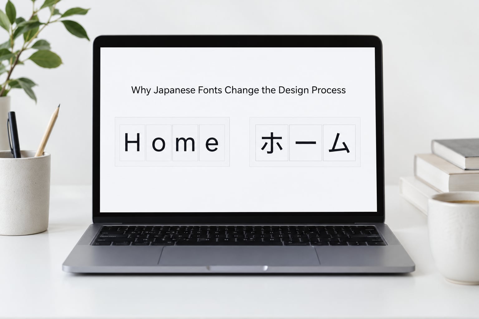
A Japanese paragraph mixes three scripts. Kanji carry most of the meaning, hiragana carry grammar and particles, and katakana handle loanwords, technical terms and brand names. Each character occupies the same width, so a line of Japanese is a row of near-identical squares rather than a row of varied letterforms.
That gives you a character budget problem that Latin never has. There are about 2,136 Jōyō kanji in everyday use, thousands more in names and place names, and Latin brings roughly 26 letters to the party. A font that covers only the JIS level-1 set will show tofu boxes the first time a customer enters a name that is not on the list.
Then there is punctuation. Japanese uses full-width forms for the comma (、), the full stop (。), brackets and the question mark, and they occupy a full character cell whether or not they draw ink. Add half-width numerals, hyphens and Latin brand names and you get a line that mixes widths, and text that looks subtly wrong even when no character is technically broken.
The practical result is that Japanese typography is closer to poster and signage design than to book typography. You are shaping blocks of equal-height glyphs, not flows of letters, and that pushes decisions toward spacing, enclosure and contrast.
| Script | What it looks like | What it does to your layout |
|---|---|---|
| Kanji | Dense square ideographs with many strokes | Needs more line height; small sizes fill in and go grey |
| Hiragana | Rounded, open, visually lighter than kanji | Looks thin when set at the same weight as kanji |
| Katakana | Angular, mostly straight strokes | Long loanwords break differently in narrow columns |
| Full-width punctuation | 、。「」and friends, each in a full cell | Creates visible gaps at line ends unless trimmed |
| Half-width Latin and digits | Narrow glyphs sitting inside square cells | Mixes awkwardly unless the Latin face is paired deliberately |
One more structural note matters for anyone reusing assets. Japanese, Simplified Chinese, Traditional Chinese and Korean fonts share a Han-character base, so they look interchangeable until they are not. Japanese fonts draw stroke terminals and radicals with locally correct shapes, and reusing a Chinese font on a Japanese page is a visible error to any reader who notices. Korean uses syllable blocks rather than characters and needs its own face entirely.
How Japanese Fonts Affect Web Design
Here is the short version. Japanese type changes seven things on a web page at once: how much vertical space a line needs, how you build visual hierarchy, how wide your text containers should be, how a label behaves in a button, what tone the brand communicates, whether readers using assistive technology get usable text, and how many megabytes the page weighs before it paints.
| Factor | What changes | Typical effect |
|---|---|---|
| Script type | Full-width square cells | Fewer characters per line, higher information density per line |
| Font weight | Stroke contrast survives or fills in | Weights below 400 blur at small sizes on low-DPI screens |
| Character coverage | Thousands of glyphs | Large files, and tofu boxes if coverage is partial |
| Writing direction | Horizontal or vertical (tategaki) | Different column rules, ruby annotation, punctuation rotation |
| Fallback resolution | OS-dependent glyph variants | Same character drawn differently on Windows, macOS and Android |
| Numerals and Latin | Half-width inside full-width text | Baseline and weight mismatches in prices and dates |
Readability and Legibility Across Japanese Scripts
Kanji, hiragana and katakana do not have the same optical weight even inside a single well-designed family. Kanji carry many strokes and read heavy, hiragana are open and airy, and katakana sit somewhere between the two. A body size that feels generous in a Gothic face can look enormous once Mincho is involved, because the fine stroke endings in Mincho thin out before the kanji go illegible.
Cramped Japanese usually shows up in three places. The first is line height: dense square glyphs with no descender or ascender buffer collide vertically as soon as leading gets tight. The second is line length, where 40 to 45 characters per line is comfortable and 60 is genuinely tiring for kanji-heavy text. The third is font size, where kana sitting next to small kanji starts to read as undersized even when the number on the stylesheet is correct.
On a phone held at arm’s length, drop the body size by a pixel or two and raise the leading. Japanese readers are used to smaller glyphs packed closer together than Latin readers are, so the instinct to shrink the type when localizing is usually backwards.
How Font Choice Controls Visual Hierarchy
English hierarchy leans on capitals, italics and small caps. Japanese has none of those, so the same page translated with the same size scale looks flat. Weight, size, enclosure, color and spacing are the whole toolkit, which means a poor font choice cannot be rescued with a heading tag.
Take an ecommerce product page. In Latin, the product name sits at 24px in a semibold and the price sits at 28px in a bold, and the eye reads the price first because both size and weight moved. In Japanese the product name might read 24px Medium while the price reads 24px Bold, and if the bold weight only thickens strokes without changing the impression of mass, the price loses. Designers repeatedly have to push Japanese headings one or two steps heavier than the English comp suggests.
News sites hit the same wall. A kicker label, a headline and a byline need three clear levels. Without capitals, the usual trick is to set the kicker smaller, in color, with letter-spacing added, and let the headline carry size and weight. It works, but it takes an extra step that English layouts never needed.
Dashboards are harder still. A numeric KPI, a chart label and a table header are all the same square grid of characters, so you separate them with background tint, padding and border weight rather than type alone. This is where Japanese type quietly pushes you toward the bento and modular layouts common on Japanese SaaS sites.
| Class | Tone | Best web use | Body-text readability |
|---|---|---|---|
| Mincho (明朝体) | Serif-like, literary, editorial | Long-form articles, publishing, brand accents | Good on screens at 17px and up; thin strokes struggle below that |
| Gothic (ゴシック体) | Neutral, modern, functional | Interface text, dashboards, ecommerce, forms | Best all-round body choice |
| Round Gothic (丸ゴシック体) | Friendly, soft, approachable | Consumer apps, education, healthcare, children’s products | Very good; open counters survive small sizes |
| Calligraphy (筆書体) | Hand-drawn, traditional, expressive | Display type and headings only | Poor; not for running text |
| Display (デザイン書体) | Decorative, novelty, high impact | Hero headings, campaign art | Not for body text at any size |
Note the one thing that quietly determines whether a Gothic reads classical or modern: the size of its hiragana relative to its kanji. A face with small kana looks formal and traditional. One with proportionally larger, rounder kana reads contemporary and friendly. That proportion shifts the brand tone more than any other single attribute, and it is worth checking before you commit.
Choosing a Typeface for a Japanese Website
Start from the job the type has to do, not from the specimen that looks nicest. If the page is an interface, you need a Gothic with a wide weight range, clear numerals, and glyph coverage that includes common names. If it is an editorial site, Mincho gets you the reading experience readers expect from long articles.
Then check coverage before aesthetics. Ask the vendor for the glyph count and whether the face covers JIS level-1, JIS level-2 and JIS level-3, or at minimum the Jōyō set plus common surnames. Free Japanese fonts with full coverage are genuinely scarce, which is the single most repeated complaint in designer communities like r/graphic_design.
Next, decide how many fonts you ship. Two families is already expensive in page weight once you move past system fonts, so most teams ship one Japanese family with two or three weights and use system fonts for everything else. A separate display face is worth it only if it is genuinely a different design, and only for headings.
For pairing with Latin, the cleanest rule is to pick a Japanese face whose Latin companion is deliberately quiet, then set Latin runs in the system UI face rather than pretending the Japanese font’s own Latin is good enough. Mixed text that pairs a geometric Gothic with a Mincho Japanese face reads as a mistake, not a bilingual design.
Finally, check the license before you fall in love. Japanese fonts are distributed under more varied terms than Latin ones, and several popular retail faces are desktop-only or cover web use with a separate tier. Confirm the license covers web delivery, embedding and any app or e-book distribution before launch, not after.
And test with real interface copy. Not lorem ipsum, not English placeholders. A heading, a button, a price, an error message and one long product name in actual Japanese will tell you in ten seconds what a specimen sheet never will.
Line Height, Letter Spacing, and Layout Constraints
The number most Japanese design guides agree on is 1.7 to 1.8 for body copy. Latin body text sits comfortably at 1.4 to 1.6, so a stylesheet copied from an English site will feel visibly tight in Japanese. Headings can drop closer to 1.4, and one-line labels do not need leading at all.
Letter spacing is the opposite case. Japanese glyphs are monospaced-width squares, so adding tracking immediately loosens the grid and can make the block look unfocused. Keep it at zero for body copy, use small positive tracking sparingly on all-caps Latin labels, and use negative tracking only on large display headings where you want them to hold together as a block.
/* Japanese type scale: tighter type, looser leading */
:root {
  --jp-body-size: 1rem;      /* 16px */
  --jp-body-leading: 1.8;    /* vs 1.5 for Latin body copy */
  --jp-heading-leading: 1.45;
  --jp-measure: 38ch;        /* roughly 38 Japanese characters per line */
  --jp-measure-wide: 64ch;   /* long-form editorial width */
}

p, li {
  font-size: var(--jp-body-size);
  line-height: var(--jp-body-leading);
  letter-spacing: 0;
  text-align: left;          /* justify is rarely right for CJK body copy */
}
Line breaking is handled by the browser through Japanese kinsoku rules: a line may not start with a closing bracket or a small kana, and may not end with an opening bracket. Browsers do this well, which means you should never insert manual line breaks inside Japanese body copy. Manual breaks break the rules and look wrong on the next screen size.
Container width interacts with density. Japanese packs roughly twice the information per line that English does at the same pixel width, so a 1200px English grid holding 90 characters will hold the equivalent of a lot of Japanese. On dashboards and category pages, this is why Japanese sites often use tighter containers and more modules rather than wider margins.
Buttons and form fields are where this bites hardest. A fixed-width button sized from the English label will clip. The fix is to size controls from the Japanese string with padding to spare, allow labels to wrap, and set a minimum width per control rather than a fixed one. Error messages need roughly 1.5 times the room their English equivalents get.
Vertical writing is supported in every current browser through writing mode. If you are rendering traditional or literary material, set the container to vertical-rl and let the browser rotate punctuation and stack ruby correctly rather than fighting it:
.vertical-text {
  writing-mode: vertical-rl;
  text-orientation: mixed;   /* keeps Latin runs upright-rotated correctly */
  line-height: 1.8;
  max-height: 40em;
}

ruby {
  ruby-position: over;
  ruby-align: center;
}

/* Long vowels and marks keep their vertical forms */
.vertical-text .prolonged-sound-mark {
  text-combine-upright: all;
}
Font Loading, Page Speed, and Rendering Performance
Here is the rule worth quoting: use the operating system’s Japanese fonts first, and only ship a custom Japanese webfont when the brand genuinely requires it. Every current desktop and mobile OS already ships good native Japanese faces, and skipping the download removes the single heaviest asset on a Japanese page.
The reason Japanese fonts are large is arithmetic. Latin text needs a few hundred glyphs. A Japanese face needs thousands, and the large pan-CJK families ship well over 20,000 glyphs to cover Japanese, Chinese and Korean in one file. Uncompressed, those files run into the tens of megabytes; converted to woff2 and still covering the full set, you are typically looking at several megabytes. Subset to the characters a page actually uses and the same file drops to a few hundred kilobytes.
| Approach | Payload | Consistency across devices | Best for |
|---|---|---|---|
| System font stack | Zero | Low; glyph variants differ per OS | Functional sites, most SaaS products |
| Full pan-CJK webfont | Several MB | High | Design-led consumer brands with generous budgets |
| Subset Japanese webfont | 100 KB to 1 MB | High | Marketing pages, hero type, long-form editorial |
| unicode-range split | Only the slices the page uses | High | Multi-language sites with a shared CDN font pipeline |
Declare the stack per platform. The family names differ across operating systems, and a stack that skips them will silently drop to a generic serif or to a Chinese face on the wrong device.
.jp-text {
  font-family:
    "Noto Sans JP",        /* your webfont first, if you ship one */
    "Hiragino Sans",       /* macOS and iOS */
    "Hiragino Kaku Gothic ProN",
    "Yu Gothic",           /* Windows */
    "Yu Gothic UI",
    Meiryo,                /* older Windows */
    "Noto Sans JP",        /* Android and Linux fallback */
    "MS PGothic",          /* last-resort legacy Windows */
    sans-serif;
}
When you do ship a webfont, declare it properly, preload it, and split it by unicode range so the browser downloads only the slices a page needs.
/* 1. Declare the face with a swap so text paints immediately */
@font-face {
  font-family: "Brand Sans JP";
  src: url("/fonts/brand-sans-jp.woff2") format("woff2");
  font-weight: 400;
  font-display: swap;
  unicode-range: U+0041-005F, U+3000-303F, U+3040-309F, U+30A0-30FF, U+4E00-9FFF;
}

/* 2. Preload the one file above the fold */
<link rel="preload"
      href="/fonts/brand-sans-jp.woff2"
      as="font"
      type="font/woff2"
      crossorigin>
/* 3. Split the family into kana, punctuation and kanji slices so the
      browser only fetches the ranges the page actually renders */
@font-face {
  font-family: "Brand Sans JP";
  src: url("/fonts/jp-kana.woff2") format("woff2");
  font-weight: 400;
  font-display: swap;
  unicode-range: U+3040-309F, U+30A0-30FF;         /* hiragana + katakana */
}
@font-face {
  font-family: "Brand Sans JP";
  src: url("/fonts/jp-kanji-subset.woff2") format("woff2");
  font-weight: 400;
  font-display: swap;
  unicode-range: U+4E00-9FFF;                     /* only the kanji you subset */
}
Generate those subsets from your actual page content rather than guessing. Extract every Japanese string from the build, or crawl the production pages, and hand the character set to a subsetting tool such as the command-line tools shipped with the major open-source Japanese families. Add a safety margin for dynamic content, because a user-generated name is exactly where an incomplete subset shows a tofu box.
Two performance notes finish this off. font-display: swap prevents invisible text while the font loads, at the cost of a brief layout shift when the swap happens, so reserve space for the text rather than accepting the shift. And remember that a Japanese page is usually slower than its English counterpart for reasons beyond fonts: more content per screen, more images per screen and denser tables all add weight.
How to Test Japanese Fonts Before Launch
Run this as a checklist before the Japanese site goes live. It takes under an hour and catches nearly everything that goes wrong.
- Load every real page with actual Japanese copy, not English placeholders or lorem ipsum.
- Check the full character coverage your content needs: kanji, hiragana, katakana, full-width punctuation, half-width Latin and numerals.
- View the same string on Windows, macOS, iOS and Android, then confirm you are happy with the different glyph variants rather than assuming they match.
- Test current Chrome, Safari, Firefox and Edge, and include at least one real iPhone and one real Android handset.
- Zoom to 200% and check that line breaks still follow kinsoku rules and no text is clipped.
- Trigger every loading state: throttle the connection, block the font, and confirm the fallback stack still renders readable Japanese.
- Type into every form field with a Japanese IME active and confirm the candidate window does not overlap or clip labels.
- Resize buttons and inputs to the longest real Japanese label, then re-check at the narrowest supported width.
- Run a screen reader over headings, forms and error messages to confirm Japanese is announced correctly and ruby annotations do not duplicate.
- Compare the design file against the browser at 100% zoom, since previews render Japanese differently from shipped pages.
- Confirm the fallback stack renders acceptable Japanese if the webfont fails entirely, not just a generic sans-serif.
- Verify the license covers web delivery for every font in the stack, including the fallback you hope never loads.
Frequently Asked Questions
Are Japanese web fonts harder to load than Latin fonts?
Yes, and by a wide margin. A Latin webfont typically covers a few hundred glyphs and weighs tens of kilobytes, while a Japanese face needs thousands of glyphs and can reach several megabytes even as woff2. Subsetting the family to the characters your pages actually use brings it back down to a few hundred kilobytes, which is why subsetting is the standard fix.
Should Japanese and Latin text use the same typeface?
Not usually. A Japanese face includes Latin glyphs, but they are often narrow or visually mismatched with the interface font used elsewhere on the page. The cleaner pattern is to let the Japanese stack handle Japanese characters and set Latin runs in your system or brand UI face. This also keeps your Latin payload small and fast.
What is the best font size for Japanese website body text?
Around 16px for interface text and 17px to 18px for long-form articles works well on desktop, with a line height of roughly 1.7 to 1.8. Japanese glyphs are denser than Latin letters, so leading matters more than size. Going smaller usually makes kanji blur together rather than making the page feel cleaner.
Can Japanese websites use built-in system fonts?
Yes, and for most functional sites that is the better choice. Windows, macOS, iOS and Android all ship usable Japanese faces, so a system stack costs zero bytes. The trade-off is that kanji glyph variants differ between operating systems, so pick a stack whose members have similar shapes and accept minor differences for brands that do not need pixel-level consistency.
How do I choose a Japanese font for a responsive interface?
Choose on three axes: glyph coverage for the characters you will render, a weight range that separates interface levels without relying on size alone, and file weight after subsetting. Test with the longest real label at the narrowest supported width. A font that works at 1440 pixels often breaks in a mobile button, so mobile is the real test.
What license information should designers check before using a Japanese font?
Check whether the license covers web delivery, embedding, and any app, e-book or advertising use, since Japanese fonts are often sold in separate tiers. Free faces usually permit web use but may restrict redistribution of modified files, which matters if you subset. Keep a record of the license with your brand assets before launch, not after a legal review flags it.
Conclusion: Start With Readability, Then Add Personality
The best Japanese typeface for a website is decided by four things, in this order: readable script coverage that includes the characters your users actually type, a hierarchy that works without capitals or italics, a loading strategy that keeps the page weight sane, and a visual tone that fits the product. Get the first three right and the fourth is a pleasant afternoon.
Start with a system font stack on real Japanese copy, on a desktop and on a phone. Note what breaks. Only then decide whether a custom face earns its weight, and if it does, subset it from your actual content before launch. That first hour of testing will save you the week you would lose chasing a missing glyph in production.