Japanese sites use so much text in images for a mix of reasons, and no single one explains it: Japanese copy mixes three writing systems with no word spacing or capital letters, so designers rely on weight and scale for hierarchy, and localization pipelines often flatten finished artwork into flat images. Some of that is a genuine language and design constraint, and some is a leftover from a slower, smaller-screen web.
The useful part is telling those apart. A campaign banner with a headline baked into a JPEG is a deliberate choice. A 2011-era product grid that is one giant image nobody can select, search or translate is a production habit nobody has revisited.
We went through the arguments people actually make about this, including the ones from a long Hacker News thread on Japanese web design, and separated the ones that survive contact with real sites from the ones that are mostly theory.
Table of Contents
- 1What Does Text in Images Mean on Japanese Websites?
- 2What Explains the Widespread Use of Image Text?
- 3Why Japanese Sites Use So Much Text in Images
- 4How Does Japanese Language and Localization Affect Image-Heavy Design?
- 5Is Text in Images a Japanese Design Tradition?
- 6How Have Older Web Practices Shaped Japanese Sites?
- 7What Are the Benefits and Drawbacks of Putting Text in Images?
- 8Why Japanese Sites Use So Much Text in Images on Modern Websites
- 9How Can Designers Use Text in Images Responsibly?
- 10Frequently Asked Questions
- 11Does putting text inside images hurt SEO?
- 12Why do Japanese websites sometimes use vertical or tightly packed text?
- 13How should alt text describe text embedded in an image?
- 14Does translating a Japanese image into English make it accessible?
- 15Is dense typography still common on modern Japanese websites?
- 16Conclusion
What Does Text in Images Mean on Japanese Websites?
Text in images means the words are pixels. A headline, a price block, a table of specifications or a paragraph that reads normally on screen is part of a JPEG, PNG or WebP file rather than live HTML text the browser can select.
That distinction matters more than it sounds. Live text reflows when the viewport changes, scales with the reader’s zoom setting, inherits the user’s font size preference, works with browser translation, gets indexed by search engines, and gets announced by a screen reader. Rasterized text does none of that. It sits at the exact size it was exported at, and that is the only size it will ever be.
The pattern is not universal, and treating it as one causes most of the arguments. Within a single category you will find a major retailer running a clean semantic product page next to a long-running campaign site where the entire hero block is a flat image. Government and municipal pages skew dense. Big consumer electronics brands and many news portals are much closer to the restrained end of the spectrum.
So the honest framing is site, era, audience and device rather than country.
What Explains the Widespread Use of Image Text?
Five explanations come up repeatedly. They are not alternatives — they stack. A campaign page in 2026 might be showing all five at once, which is exactly why the debate gets muddled.
| Explanation | How it produces image text | Counter-evidence |
|---|---|---|
| Language mechanics | Three scripts, no word spacing, no capitalisation, line-break rules that make live text hard to lay out | Neighbouring CJK markets use the same writing system and do not flatten their pages to images |
| Typography and tooling | Few display faces with usable weight and scale steps, so weight carries the whole hierarchy | Cross-pan CJK web fonts exist now and are widely used |
| Preference for explicit information | Dense layouts get read as thorough; gaps get read as vague | Large Japanese brands and consumer sites are deliberately sparse |
| Print, TV and ad heritage | Decades of dense poster, packaging and broadcast graphic design set the expected look | Explains density, not specifically images over HTML |
| Legacy web production | Screenshot UI, table layouts, campaign artwork exported once and never rebuilt | Explains the oldest examples best, weakest on current sites |
The pattern in the table is worth stating plainly: the first three explanations are about Japanese language and design culture, the last two are about how websites used to get built. Only the first three predict anything about a site launched this year.
Why Japanese Sites Use So Much Text in Images
Here is how the pieces interact in practice. Japanese copy packs a lot of meaning into a small number of characters, which is a real reason for larger type and tighter blocks. But larger type plus a need for hierarchy is not a reason to export a JPEG — it is a reason to choose a type scale. The step from “dense” to “image” comes from somewhere else: a design tool that makes the second thing easier, a localization vendor who received flattened creative, or a team that decided pixel-perfect control mattered more than responsiveness.
That distinction is the whole argument. Density is Japanese. Rasterizing is a workflow decision, usually inherited rather than chosen.
How Does Japanese Language and Localization Affect Image-Heavy Design?
Japanese runs kanji, hiragana and katakana at the same time. Kanji are logographic, so one character can carry an entire concept, and hiragana handles grammar alongside them. Katakana takes foreign loanwords. This is the answer to the question of why Japan uses characters descended from Chinese: kanji were imported for centuries, then reshaped and simplified through Japanese use until they became a separate part of the system.
Two consequences follow for layout. There is no space between words, so the eye relies on line breaks and spacing around punctuation rather than gaps in the line. And there is no capitalisation, so a designer cannot signal a heading the way a Latin-language designer does with one uppercase word.
Line breaking has its own rule set. Kinsoku shori forbids certain characters at the start or end of a line — a small kana ending cannot begin a line, and closing punctuation cannot be orphaned at the top of one. It is why Japanese paragraphs look slightly pushed around. Browsers handle most of this, but the workaround designers reach for when a layout looks wrong in a specific CMS is to export the block as an image and stop fighting it.
Vertical writing, tategaki, runs top to bottom with columns moving right to left. It is genuinely traditional and still used for certain published material, but its presence on a modern web page usually signals a reproduced print layout rather than a live design decision.
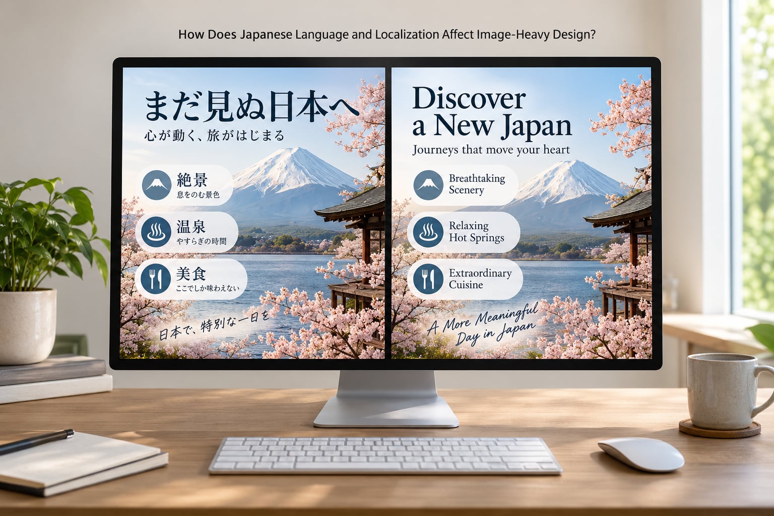
Localization is where image text gets locked in. When a campaign is produced once in Japanese for several markets, the copy frequently stays inside the artwork. The English version is a separate file with the words still burned in, which means the English page can never reflow, never resize, and never be translated by the browser. Exporting a finished design is a normal localization step, and it silently produces a page that looks finished and behaves like a picture of a page.
Is Text in Images a Japanese Design Tradition?
Print, advertising, packaging and broadcast graphics all reward density, and Japanese versions of each have been dense for a long time. A commenter in a Hacker News thread who builds Japanese-language sites for a company pointed at 1980s Japanese television as the strongest influence — bitmapped text overlays in loud colors, words superimposed over presenter headshots, lower thirds packed with data. That is a visual grammar of maximum information in minimum space, and it trained an audience to read density as normal.
There is a print argument too. Japanese editorial and packaging design has long used small type, tight leading and dense blocks as a mark of seriousness, the opposite of the whitespace-as-luxury convention that dominates Western branding.
What none of this explains is the move to images. Dense print is still live text. Something in the argument usually gets quietly dropped, and it is the part where a page becomes a picture.
So be careful with the framing. Calling Japanese sites garish or cluttered describes a value judgment, not a defect. The mirror image of that judgment exists too: people who use Japanese sites describe Western ones as bland and thin on detail. Both are audience-relative reactions, and a design that reads as information-poor in Tokyo can read as information-rich in London. Presenting that symmetry is not politeness, it is just accurate.
How Have Older Web Practices Shaped Japanese Sites?
A large share of the worst examples are not cultural at all. They are the residue of how websites were assembled in the 2000s, when a designer working in Photoshop or Illustrator exported layout blocks as images because that was the most reliable way to get pixel-identical results across browsers.
That era left a few recognizable marks. Table-based layouts with fixed pixel widths that break or force sideways scrolling on a phone. Banner-heavy headers stacked to force page length. Rasterized campaign artwork from a print run still sitting above live content years later. Content management systems where a designer uploads a finished banner as a single file, and nobody downstream can edit the words inside it.
Two of these are still worth knowing as a reader. A page that scrolls sideways on a phone is usually a fixed-width layout that never got rebuilt. A wall of tiny type that no zoom control touches is often an image, and zooming does nothing because there is no text to zoom.
Checking whether a page was built in that era takes about a minute. Try to select a headline with the cursor. Try browser translate on the main image. Look at whether the phone layout reflows. If none of the three behave, you are looking at an old pattern, not a live design philosophy.
What Are the Benefits and Drawbacks of Putting Text in Images?
There are real reasons to do it. Total control over the rendering, guaranteed appearance across devices and browsers, no font licensing or subsetting work, and a layout that can be handed to a print or social team unchanged.
| Consideration | Live HTML text | Text inside an image |
|---|---|---|
| Appearance across browsers | Consistent with modern font stacks | Exactly as exported |
| Reflow on small screens | Reflows automatically | Fixed or scrolls |
| Reader zoom and font-size preference | Responds | No effect |
| Screen reader | Read aloud | Skipped unless alt text covers it |
| Browser translation | Translated | Needs OCR, often skipped |
| Search indexing | Indexable | Not indexed |
| Copy and find in page | Works | Does not work |
| Editing later | Change the text | Re-export the image |
The two columns are not close. Image text wins on one thing — exact rendering — and loses on everything a page has to do after it loads.
The accessibility cost deserves naming plainly. A page delivered to a blind user as a screenshot is a page with no content. One person writing about a blindness-awareness event described meeting a site that had exactly that problem, and the story stuck with readers because the failure is invisible to sighted testers.
Then there is translation, which is the part people hit most often. Chrome cannot translate pixels. A traveller who lands on a Japanese booking flow built from flat images has two bad options: struggle through the characters, or run the image through an OCR-based translator such as Yandex, which usually works but is slower, less accurate and easy to fail on small type.
Search visibility takes the same hit. Rasterized text is not indexed, so a page can look substantial and be nearly invisible to a crawler. Alt text is the partial fix, and it is only the fix if someone wrote real sentences rather than a filename.
Why Japanese Sites Use So Much Text in Images on Modern Websites
Checked across a spread of Japanese retail, media and government pages in 2026, the current picture is mixed, and the reasons have moved on from the old ones.
What is genuinely current: social and campaign graphics designed once at large size and resized for every channel, where the headline is part of the brand lockup. Dense information design on finance, logistics and public-sector pages, where tables of dates, fees and codes are the point. Pixel-perfect brand work where a brand team has signed off on a composition and nobody wants to negotiate spacing with the rendering engine.
What is inherited: image-heavy promotional pages that have not been rebuilt since the era when that was normal, still running on fixed-width assumptions and export-at-480px thinking. The tell is usually a header image with type in it that breaks on a phone.
Japanese designers also point out that the tooling defaults, not the audience, decide a lot of this. Western design tools ship whitespace-first, Latin-first workflows. Change the default and a surprising amount of the density follows it out of the file.
One more explanation gets quoted often and deserves a clear label: the argument that readers trained in East Asian scripts take in more of a scene at once, while readers trained in Latin scripts focus on individual objects. It is a real research question and it is contested, not settled. It is also about cognition, not about images, so it cannot carry the image-text question on its own.
How Can Designers Use Text in Images Responsibly?
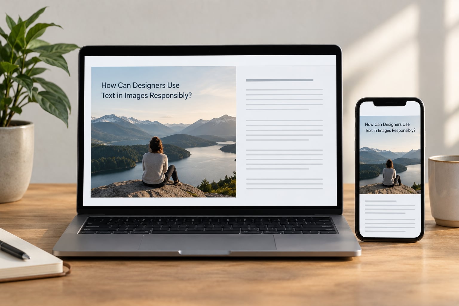
If you are shipping a site for the Japanese market, the goal is to keep the density the audience expects and drop the parts that cost you readers.
Use images for the composition, not for the information. A campaign hero with a short headline baked in is fine. Prices, specifications, dates, terms, navigation labels and anything a customer needs to compare belong in live text. Most image-text problems I have seen are a whole content block exported because it started life as a design comp.
Ship a second locale rather than one compromise page. Japanese sites that serve English-speaking visitors well typically do it with a separate locale path or domain, which is how both Rakuten and the Pokemon Center handle the split. One page that tries to serve both audiences with baked text serves neither.
Write alt text as a description, not a label. If the image contains the words “free shipping over 50,000 yen”, the alt text should say that in a sentence, not repeat the filename. Alt text is what a screen reader gets and what a crawler indexes, so it is the only version of that text that exists for those users.
Test the two things that break first. Zoom the page to 200% and check nothing is lost or cut off, then switch your device to its largest text setting and look again. Both are accessibility requirements, and both expose image text immediately, because pixels do not grow. On Japanese pages, check that line breaks respect kinsoku shori and that your type scale holds at the sizes Japanese copy actually needs, which run longer than the English equivalent more often than people expect.
Set body text at a size you would not set in English, and give the reader a control. The font-size toggle that sits at the top of many Japanese sites is not a quirk. It is a direct answer to the same legibility problem, and it is a cheap pattern to copy.
Frequently Asked Questions
Does putting text inside images hurt SEO?
Yes, mostly by absence. Rasterized words are not indexable, so a page can look content-rich and offer a crawler very little to work with. Image text also cannot reflow on mobile or respond to the reader’s font-size setting. Alt text recovers some of it, but only where someone wrote real descriptive sentences instead of a filename.
Why do Japanese websites sometimes use vertical or tightly packed text?
Vertical writing, called tategaki, is a genuine publishing tradition that runs top to bottom with columns moving right to left. Tight packing usually comes from line-break rules instead: kinsoku shori forbids certain characters at the start or end of a line, which pushes lines around and changes how much text fits. Designers who find live text awkward to lay out sometimes flatten the block into an image to stop fighting it.
How should alt text describe text embedded in an image?
Describe the words, not the picture. If a promotional image reads limited time offer, 20 percent off, the alt text should say the image shows a limited-time offer of 20 percent off. A screen reader user gets your alt text instead of your image, and a search engine indexes it. File names and single keywords leave both audiences with nothing useful.
Does translating a Japanese image into English make it accessible?
Not properly. Machine translation of an image runs through optical character recognition, which reads pixels instead of text, so it is slower and less accurate, and it struggles with small type and vertical layouts. A blind reader still gets nothing from it. Live text that is translated properly is readable, selectable and announced aloud, which is the standard the image version cannot meet.
Is dense typography still common on modern Japanese websites?
Yes, but selectively. Major consumer electronics brands, government and municipal pages, and some news portals stay dense, while many retail and campaign sites have gone the other way and read as restrained. The older fixed-width, screenshot-style layouts are the ones disappearing, and they are disappearing because of tooling, not taste. If a page scrolls sideways on a phone, that is usually the old build, not a current design position.
Conclusion
Density in Japanese web design is real and has real causes. Three writing systems, no word spacing, no capital letters, a print and broadcast heritage that rewards packing information in, and an audience that reads thorough layouts as trustworthy. None of those forces a designer to export a JPEG.
Before you judge a page, check what it is actually doing. Try to select the headline. Try browser translate on the main image. Look at the phone layout. If it is deliberate campaign artwork, that is a brand decision and a reasonable one. If it is a content block nobody has rebuilt since the 2000s, you are looking at an inherited production habit, and the fix is live text with real alt text.