Japanese UX expectations for forms come down to one idea: users read a form as an information-gathering step, not a quick tap-through. They expect visible labels, stated format rules, required-field markers, early and polite validation, explicit privacy consent and a predictable step order. Dense, well-labelled forms reduce uncertainty for them; sparse ones create doubt.
That trips up a lot of teams shipping from the US or Europe, because the usual instinct is to strip whitespace and hide guidance behind progressive disclosure. In Japan that move usually costs you completions rather than saving effort.
Table of Contents
- 1Japanese UX Expectations for Forms: What Do Users Expect?
- 2How Should Form Labels and Instructions Be Written?
- 3Which Address, Name, and Date Formats Matter?
- 4How Do Japanese Users Expect Validation and Error Messages?
- 5What Makes a Form Feel Trustworthy in Japan?
- 6How Should Forms Work on Mobile Devices?
- 7Japanese UX Expectations for Forms: A Practical Review Checklist
- 8Frequently Asked Questions
- 9Should forms in Japan use placeholders or labels?
- 10How should form validation errors be written in Japanese?
- 11Do Japanese users expect a confirmation step after submitting a form?
- 12Do Japanese users prefer longer forms?
- 13Why do Japanese websites look denser than Western ones?
- 14Which fields must a Japanese form localize beyond the language?
- 15Conclusion
Japanese UX Expectations for Forms: What Do Users Expect?
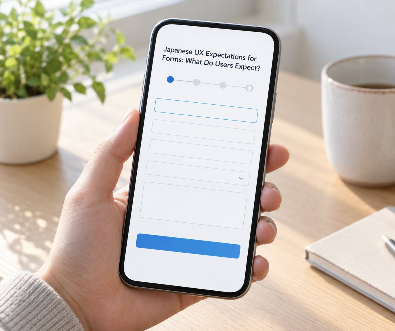
In short, they expect explicit labels, format guidance, required markers, inline validation, polite error copy, a single-column flow with visible progress and an unticked-by-default consent checkbox. Japan scores 92 on Geert Hofstede’s uncertainty avoidance index, and that shows up directly in form design: people gather the constraints before they type.
So a form that says 電話番号(ハイフンなし) above the field and marks 必須 next to it answers two questions before the user has to ask them. A form that shows a bare input with a placeholder disappears the label the moment typing starts, and leaves the user guessing whether the field is even required.
The core expectations, in the order they usually come up:
- Every field has a permanent visible label, never a placeholder doing that job.
- Required fields are marked in words, usually 必須, rather than by an asterisk alone.
- Format constraints are stated up front — half-width or full-width, hyphen or no hyphen, which date order.
- Example values show the shape of a valid answer.
- Validation runs as the user moves through a field, not after the final submit.
- Errors sit next to the field they belong to and explain how to fix it.
- Consent checkboxes start unticked and are never bundled into terms of service.
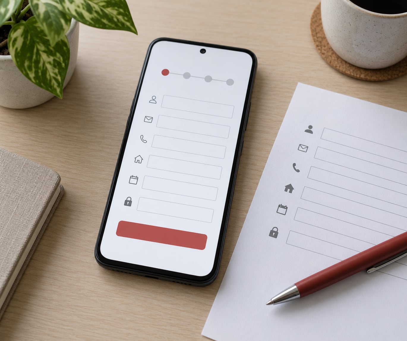
- The layout is one column, scrolled vertically, with a visible step indicator on multi-step flows.
- The submit button names the action — 送信する or 登録する — rather than saying Submit.
- Confirmation screens and emailed receipts are expected, not optional.
None of this is exotic. It is closer to how forms were designed in 2008 than how they are designed today, and that gap is the single biggest source of friction when teams port a flow from a Western codebase.
How Should Form Labels and Instructions Be Written?
Write short, concrete labels in plain Japanese and put the constraint in the label itself. 電話番号 is neutral; 電話番号(ハイフンなし・半角数字) tells the user exactly what to type and removes the most common source of a failed submission.
A few rules that save rework later:
- Labels above fields, left-aligned. Inline left labels work but sit awkwardly with the mixed kanji, katakana and Latin text a Japanese form usually carries.
- Say required or optional explicitly. 必須 and 任意 are the standard markers. A red asterisk alone is ambiguous, and a bare asterisk risks being read as a formatting mark.
- Give one example per constrained field. A greyed sample value is read faster than a sentence describing the same thing.
- Keep units in the label. 年齢(歳) or 電話番号(例:09012345678) beats a hint that disappears on focus.
- Avoid literal translation. English “First Name” becomes 名, which most Japanese forms leave empty; 名字 and 名前 in a single お名前 field works better because Japanese given names are rarely split from family names in casual use.
One-column layout is the safe default. Two-column pairs save vertical space but force users to scan sideways across kanji and mixed-width numbers, which slows them down more than the extra scrolling costs.
Which Address, Name, and Date Formats Matter?
Japanese names go family name first, dates go year, month, day, and addresses run postal code, then prefecture, then city and ward, then the rest. Getting these wrong is the fastest way to make a localized form feel foreign, because the field order itself tells the user whether you know the market.
| Field | What Japanese users expect | Common Western default |
|---|---|---|
| Name | Family name first, 名字 then 名前, often with furigana beside each | Given name first, split into first and last fields |
| Postal code | Seven digits written with a hyphen, 150-0002; the address auto-fills where the postal service lookup is available | Looser postal field, ZIP only on some markets |
| Address | Prefecture (都道府県) as its own field, then city or ward, then chome-ban-go and building | Single free-text address line |
| Phone | Mobile numbers written 090 / 080 / 070, landlines with an area code, usually no hyphens on mobile | Any format accepted, often with hyphens required |
| Date of birth | Year, month, day — 1990年4月12日 — with era dates such as 平成2年 accepted alongside | Month, day, year with a picker |
Furigana matters more than most teams expect. Supplying よみかた fields for kanji names is standard on Japanese e-commerce and banking forms because it lets the company confirm the order by phone later, and it gives older users a way to check what was entered.
Don’t force a calendar picker on every date. A three-part select for year, month and day works well for birthdays and lets users type a year far in the past without scrolling. Reserve the picker for dates bounded by the present, such as a booking date.
How Do Japanese Users Expect Validation and Error Messages?
Validate on blur and on submit, keep what the user typed, put the message beside the field, and write it politely. Validation that fires only after the final button press is the deal breaker; it forces someone to re-scan a page they thought they had finished.
On tone: user-facing microcopy in a Japanese consumer or business context uses polite form, the です/ます register, rather than the plain or blunt form used among colleagues. An error is still an error, but the phrasing carries the request rather than the accusation.
Concrete pairs, with rough glosses:
- 入力内容をご確認ください — Please check what you entered. Neutral, applies to any field.
- 電話番号を数字で入力してください — Please enter the phone number as digits.
- 郵便番号が正しくありません — The postal code is not correct.
- 必須項目を入力してください — Please fill in the required fields.
Never write something like あなたの入力が間違っています — you have entered something incorrectly. It states a fact about the person rather than the field, and it reads as a scolding.
Three more practical points. Highlight the border of the offending input, not just the message, so the eye lands in the right place. Move focus to the first error on failed submit. And keep the values the user already entered — a cleared form after one validation failure is a straight path to abandonment.
What Makes a Form Feel Trustworthy in Japan?
Trust comes from stating who runs the service, what happens to the data and what the user is agreeing to, before they submit. Japan’s APPI, the Act on the Protection of Personal Information, is the reason this is a design requirement rather than a nicety.
Practical rules for consent and disclosure:
- Consent checkboxes ship unticked. A pre-checked marketing opt-in is treated as a dark pattern, and Google’s own research into manipulative patterns in Japan found participants noticed and resisted them.
- Separate the necessary consent from optional marketing consent into two separate boxes, each with a plain-language link to what it covers.
- Show the operator’s company name and a way to reach support, not a generic no-reply address.
- State delivery timelines, return policies and fee breakdowns before the confirm button, not on a page linked from the footer.
- Make cancellation and withdrawal reachable in the same place as the original consent.
At payment, the cues that matter are recognisable and unembellished: the card brand marks, a short note on how card details are handled, and the total cost broken out including postage and tax. Bank-transfer and convenience-store payment options are genuinely expected at checkout in Japan, and their absence reads as a foreign store rather than a limited one.
Users over 70 and people using the national My Number card also form a real share of government, banking and public-service traffic. Those flows need larger type, furigana on kanji-heavy labels and no timeouts on session expiry.
How Should Forms Work on Mobile Devices?
Assume most of the traffic arrives on a phone and design the field order from the thumb. Japanese mobile forms fail less on screen space than on input method: the Japanese IME changes the keyboard mid-word, shows a candidate strip above the keys and covers the bottom of a small screen.
- Set
autocompleteattributes correctly so the keyboard offers autofill for name, postal code, email and phone. - Use
inputmode="numeric"andinputmode="email"to get the right keyboard type without forcing half-width conversion. - Keep tap targets around 44 pixels or larger, and put frequently used keys inside thumb reach rather than at the top corners.
- Autofill the address from the postal code where you can — long Japanese addresses are a typing burden that reads as effort.
- Show progress as “2/5” plus a named step, so nobody wonders how much is left.
- Keep checkout free of popups, timers and interstitial ads.
Japanese UX Expectations for Forms: A Practical Review Checklist
- Native-language review by someone who writes Japanese product copy, not machine translation.
- Every label visible at all times, no label-in-placeholder pattern.
- 必須 and 任意 markers present and consistent.
- Format rules, units and one example per constrained field.
- Name fields ordered family name first, furigana available.
- Postal code, prefecture, city/ward and street separated as Japanese addresses require.
- Dates displayed year-month-day; era dates accepted where relevant.
- Validation on blur and submit; no input cleared on failure.
- Errors beside the field, polite copy, focus moved to the first error.
- Submit button labelled with the actual action.
- Consent unticked by default, marketing consent split from required consent.
- APPI disclosure and operator identity shown before submit.
- Totals, fees and delivery terms visible before confirmation.
- Mobile pass at 360px with correct keyboard types and autofill working.
- Confirmation screen and receipt email defined.
- Type size and contrast checked with an older reader.
- Tested with at least five Japanese-speaking participants before launch.
On that last point, expect a specific kind of feedback. Participants tend to comment on tone and on whether they were certain the form accepted their input, rather than on layout mechanics, so ask them to narrate each field as they complete it.
Frequently Asked Questions
Should forms in Japan use placeholders or labels?
Use permanent visible labels above each field. Japanese users read a form for format rules before typing, and a placeholder that disappears on focus removes the only clue about what is expected. Keep the placeholder, if you use one, as an example value rather than as the label.
How should form validation errors be written in Japanese?
Write them in polite form, state what is wrong with the field, and say what to do next. Good examples include 入力内容をご確認ください (please check what you entered) and 電話番号を数字で入力してください (please enter the phone number as digits). Avoid phrasing that describes the user as wrong.
Do Japanese users expect a confirmation step after submitting a form?
Yes. A confirmation screen showing exactly what was received, plus a receipt by email or a push notification, is treated as the expected ending to the flow. It removes the doubt that follows a silent submit, and it is one of the cheapest trust signals available to a team.
Do Japanese users prefer longer forms?
They prefer well-explained forms, not long ones. A field with a clear label, a required marker and a format example reads as low effort even when there are many of them. Length becomes a problem when fields are unlabelled, optional fields are hidden mid-flow, or the same information is requested twice.
Why do Japanese websites look denser than Western ones?
Japan scores 92 on Hofstede’s uncertainty avoidance index, so users gather information before committing. Whitespace with no content is read as a lack of information, which registers as risk. Density signals that the operator has thought through the details, so removing guidance and whitespace often lowers trust rather than raising it.
Which fields must a Japanese form localize beyond the language?
Name order, postal code format, the prefecture field, address hierarchy, phone number format and date order. Japanese names are written family name first, postal codes carry a hyphen, and dates run year, month, day. Era dates such as 平成 or 令和 should be accepted wherever older users are likely.
Conclusion
Make the form explicit, make it locally correct, and test it with Japanese speakers before launch. Explicit means every label visible, every constraint stated, every required field marked. Locally correct means family name first, prefecture separated, year-month-day, polite error copy, unticked consent. And tested means at least five real sessions with Japanese-speaking participants, because the failure modes here are specific enough that guessing wastes a launch.