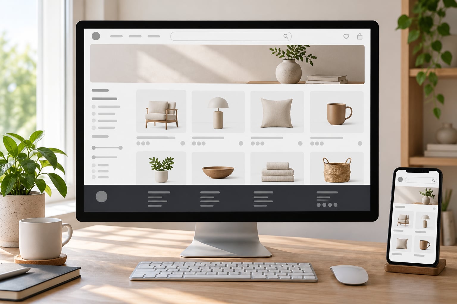
Japanese ecommerce pages are laid out as dense, reassurance-first interfaces rather than single-action funnels. A typical page stacks a multi-zone header, a category or ranking rail, a product grid, spec-heavy detail pages, explicit delivery and returns blocks, review modules, and a specification-heavy footer. The structure is built to answer several visitor types at once, which is why it feels busier than a Western template.
I’ve spent a lot of time staring at Japanese storefronts next to their Western equivalents, and the difference is not decoration. It is architecture. This guide walks through the zones top to bottom, explains what each one is for, and covers what breaks when a Western template is dropped into the market unchanged.
Updated for 2026.
Table of Contents
- 1The Core Structure of a Japanese Ecommerce Page
- 2How Japanese Ecommerce Pages Organize Navigation
- 3Category menus and mega-panels
- 4Breadcrumbs
- 5Search placement
- 6Filters, sorting and counts
- 7How page types differ
- 8What Product Detail Pages Usually Include
- 9How Japanese ecommerce pages are laid out around the product decision
- 10Reviews, ratings and the Q&A corner
- 11Text layout rules that break Western templates
- 12How Japanese Ecommerce Pages Use Promotions and Merchandising
- 13What Makes Japanese Ecommerce Pages Feel Trustworthy
- 14Shipping and delivery information, stated early
- 15Returns, warranty and support contact
- 16Payment method icons
- 17Transparent pricing
- 18Peer reviews and Q&A
- 19Legitimacy marks
- 20A short glossary of the labels you will see
- 21How the Layout Changes on Mobile
- 22How Checkout and Purchase Flows Are Structured
- 23How to Evaluate a Japanese Ecommerce Page
- 24Frequently Asked Questions
- 25What is the most common layout for a Japanese ecommerce page?
- 26How do Japanese ecommerce websites organize product categories and filters?
- 27What information should a Japanese product detail page make easy to find?
- 28How do promotions and seasonal campaigns affect Japanese ecommerce page design?
- 29What trust signals should shoppers look for on Japanese ecommerce sites?
- 30How does the checkout process usually differ from browsing on a Japanese ecommerce site?
- 31Conclusion
The Core Structure of a Japanese Ecommerce Page
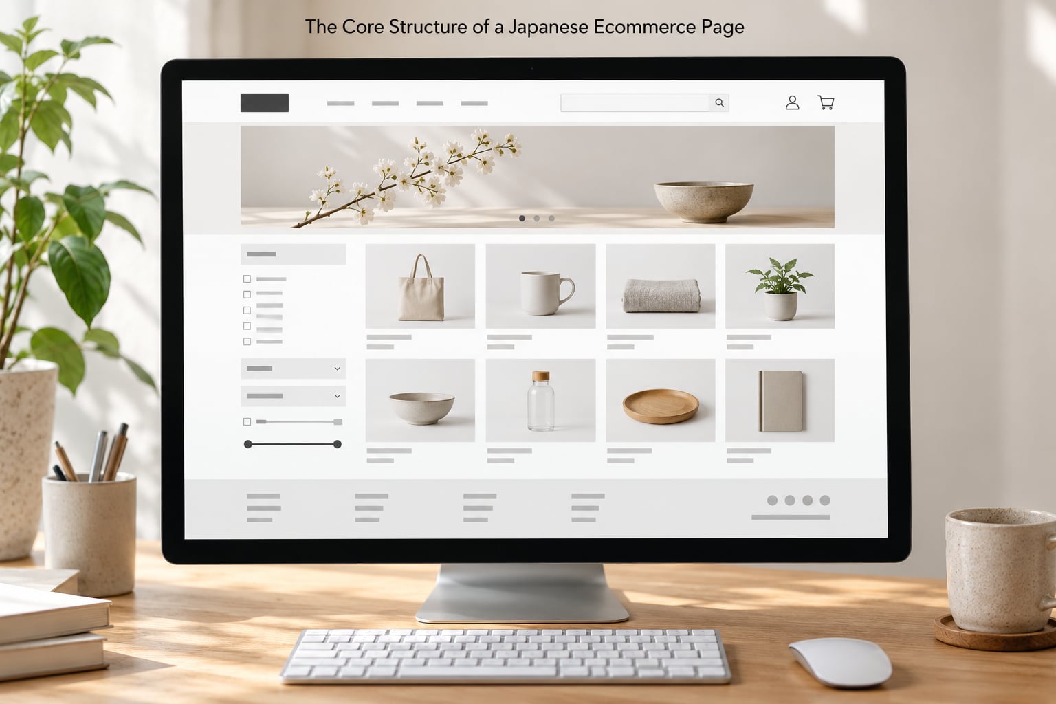
A Japanese ecommerce page is laid out as a service counter, not a funnel. Instead of guiding every visitor toward one button, the page splits into labelled zones that answer a specific shopper’s question at the same time.
Here is the ten-zone stack you will see on most commercial Japanese pages, roughly top to bottom:
- Utility header — store name, search, account, cart, and often a plain text strip for support, delivery policy and store locator links.
- Category navigation — a wide menu bar, frequently paired with a mega-panel that lists subcategories and recommended items.
- Campaign rail — a horizontal strip of seasonal or promotional banners, usually the highest-contrast element on the page.
- Ranking or recommendation module — “popular now” and “selling fast” lists, which are structurally distinct from brand navigation and function as merchandising.
- Product grid or featured set — small cards, typically 4 to 6 across on desktop, each with image, name, price, tax display, rating, and a points line.
- Filter and sort sidebar — on category pages, always present and always left-side on desktop.
- Product detail block — gallery, price, variant selectors, quantity, delivery estimate, availability line, add-to-cart and buy-now controls.
- Reassurance stack — delivery, returns, warranty, payment methods, points, and customer service, usually as icon rows or compact tables.
- Reviews and Q&A — rating summary, written reviews, and a separate question-and-answer area.
- Specification footer — company details, policies, payment and delivery information, customer service contacts, and legal links.
Compare that to a typical Western homepage, which usually has a logo, a short nav, one hero, one grid, and a thin footer. The Japanese page is doing roughly twice the work per screen because it is serving a first-time visitor, a comparison shopper and a returning points member in the same viewport.
That dual purpose is the thing Western teams miss. A sparse page aimed at one action reads, to many Japanese shoppers, as an incomplete one. Density only becomes a problem when the hierarchy underneath it is weak.
| Page zone | Common Western approach | Common Japanese approach |
|---|---|---|
| Header | Logo, nav, cart, minimal utility links | Logo, search, account, cart plus a text strip for support, policy and store info |
| Navigation | Short top menu, hover dropdowns | Category bar with mega-panels listing subcategories and suggested items |
| Promotions | Single hero, rotates weekly | Banner rail with several campaigns visible at once, plus a ranking module |
| Product card | Image, name, price, rating | Image, name, price with tax shown, rating, points earned, delivery cue |
| Category page | Filters in a drawer, sort at top right | Persistent left filter sidebar, sort row, item count, grid of 4 to 6 columns |
| Product page | Gallery, price, variants, add to cart, accordion specs | Same core plus points, delivery date estimate, payment icons, review summary and Q&A near the top |
| Trust content | Footer policy links, small trust badges | Dedicated reassurance blocks with shipping, returns, warranty and contact, visible before add-to-cart |
| Footer | Link columns, social, legal | Dense policy text, payment methods, operator company profile, contact, legal and disclosure sections |
None of this is decoration, and none of it is optional if you want to compete. The next sections go through each zone in detail.
How Japanese Ecommerce Pages Organize Navigation
Japanese navigation is built to answer “where am I and what else could I want” at the same time. A department store site, a marketplace listing and a single-brand store all use the same underlying components but weight them very differently.
Category menus and mega-panels
The category bar is usually full width and always visible rather than hidden behind a hamburger on desktop. Opening a category typically reveals a mega-panel with three or four columns: subcategories on the left, popular items beside them, and a promotional image on the right. This is a service-counter behaviour — the panel is not just a menu, it is a second chance to sell.
Breadcrumbs
Breadcrumb trails sit directly below the header on category and product pages, written as a path from the top-level category down to the current item. They are longer than Western trails because the category tree is deeper, and they frequently include a campaign or season segment when a product has been featured.
Search placement
Search sits in the header on nearly every commercial page, and on marketplace sites there is often a second search on the results page itself. Search results pages are not a blank grid with a filter drawer; they carry a left filter column, a sort row, an item count, and a comparison option, because Japanese shoppers tend to narrow with facets rather than typing long queries.
Filters, sorting and counts
On desktop, filters are a permanent left sidebar with checkboxes and price bands, not a hidden panel. Sorting is a labelled row above the grid — popularity, newest, price, review count, release date — rather than a single small dropdown. The result count is stated in text above the grid, which sounds trivial but reduces the anxiety of shoppers comparing across tabs.
How page types differ
- Department store sites lead with the category tree and season navigation. A large brand archive sits close to the top, and a brand or designer index is treated as a primary navigation destination.
- Marketplaces lead with search and ranking. The homepage is a set of merchandised lists — new arrivals, best sellers, time-limited deals — because the platform cannot assume a category structure.
- Single-brand stores cut the category tree hard and lean on a story banner plus a strong product grid. The reassurance stack does the heavy lifting, since an unfamiliar brand has no reputation to borrow.
- Campaign and seasonal landing pages behave like a shoppable editorial page. Product tiles are interleaved with explanatory blocks, and navigation is deliberately reduced to keep the campaign in focus.
One more difference worth noting: a “frequently viewed together” or comparison function is common on Japanese category pages. Comparison shoppers are treated as a first-class audience, not an edge case.
What Product Detail Pages Usually Include
A Japanese product detail page is built around the decision, not the description. Price, tax, points, delivery date and availability sit high on the page, close to the buy controls, and the long-form detail is pushed down into disclosures where it can be expanded on demand.
The usual order runs: breadcrumb, then a gallery with thumbnails and often a short product video, then the product name in Japanese and English, then a review summary line, then price with tax included, then variant selectors such as colour or size, then quantity, then delivery and availability, then the add-to-cart and buy-now controls, then the reassurance icons, then an accordion of details, then written reviews, then questions and answers, then related items, then the specification footer.
How Japanese ecommerce pages are laid out around the product decision
Every zone near the top of a Japanese product page exists to answer a question the shopper has not asked out loud yet. Price with tax shown means “am I being ambushed at the end?”. The points line means “what do I actually keep?”. A delivery estimate for a specific region means “will this arrive when I need it?”. Written reviews with a photo count mean “have other people like me bought this?”.
That ordering is the single clearest difference from a Western product page, where the gallery and description often lead and the delivery and returns details sit below the fold. Japanese pages move logistics up because logistics is the objection, not the detail.
Reviews, ratings and the Q&A corner
Reviews are treated as a navigational module, not a footer extra. The summary block shows the average, the star distribution, and the total count, and individual reviews carry a nickname, a date, a rating, a body, and often a table of optional attributes like size or fit. Photos matter: reviews with images get visibly more weight in most designs.
The questions-and-answers area is separate and sits below the reviews. It is a genuinely useful support tool — pre-purchase questions get answered publicly, which reassures the next shopper, and it feeds the page’s search visibility for long-tail product questions. Vendors who answer quickly in that thread are visibly rewarded by the resulting trust.
Text layout rules that break Western templates
This is where non-Japanese teams lose a revision cycle. Japanese text has layout requirements that most Western CSS defaults handle badly:
- Kinsoku shori — line-break prohibition rules stop a line from starting with a closing bracket or a small kana, or ending with an opening bracket. Browsers handle this well, but templates that hard-code line heights and fixed-height text boxes break it.
- Mojigumi — spacing is adjusted between mixed character classes, so Latin numbers inside Japanese text sit slightly differently than they would in a pure Latin line. Fixed-height copy blocks are the usual casualty.
- Ruby text — phonetic guides are common in headlines and product names, and a font stack without proper support renders them badly or drops them.
- Full-width characters — full-width Latin and digits change line length and wrapping. A layout tuned for half-width numbers can overflow.
- Tategaki — vertical writing is used in some editorial and campaign treatments, and it needs dedicated handling rather than a rotated div.
- Variable character height — a Japanese product name can wrap to two or three lines where a Latin name fits one, so image boxes, product cards and buttons need to tolerate variable height rather than clip.
The practical fix is to stop assuming fixed text box heights anywhere, and to test with real product names of realistic length rather than lorem ipsum.
How Japanese Ecommerce Pages Use Promotions and Merchandising
Promotions on Japanese ecommerce pages occupy defined zones rather than spreading across the page as an afterthought. A campaign banner rail sits under the category bar, ranking modules sit beside or below it, and a points or coupon module usually appears near the buy controls where it can still influence the decision.
Three patterns repeat. Time-limited sales get a distinct label and often their own count or stock counter. Bundles are shown as related-item sets with a combined saving, not as a separate offers page. Curated collections are merchandised as themed rails — new season, gift recommendations, items under a price threshold — which lets a shopper browse by intent instead of by category.
Loyalty messaging is a layout element too. Showing how many points a purchase earns at the point of decision does more work in Japan than a discount of the same face value, because the points are treated as retained value rather than spend now.
Seasonal events drive large structural changes. Tax-free shopping periods add dedicated explainer blocks and often a temporary entry point in the header. Year-end and mid-year gift seasons change the entire homepage hierarchy to gift guides and wrapping options. Major sale periods such as the January and July sales repopulate the ranking modules and collapse the editorial content. The underlying page structure stays the same; the weighting of the zones changes completely.
What keeps this from becoming noise is that the shopping task stays in one fixed place. Promotions move around it, not over it.
What Makes Japanese Ecommerce Pages Feel Trustworthy
Japanese shoppers judge an unfamiliar store by visible care, not by feature count. A page that looks thin, vague or unhurried reads as a risk, and the abandonment that follows is invisible in analytics because the visitor simply leaves. Each trust signal below removes one specific worry.
Shipping and delivery information, stated early
Delivery cost, free-delivery thresholds, handling time and carrier are usually visible before add-to-cart, and often repeated as an estimated arrival date in the product block. This is the strongest single reassurance cue, because unexpected delivery cost is one of the most common reasons a basket gets abandoned at the payment step.
Returns, warranty and support contact
A return window, who pays return postage, and a warranty period appear as their own block, not buried in the footer. A visible phone number, mail address or support link reinforces this, and operator company information usually appears in the footer with the specific business name, address and contact details of the site operator.
Payment method icons
Credit cards, mobile payments, code-based payment and convenience-store payment are shown as recognisable icons near the buy controls. Convenience-store and code-based payment are not fringe options here; they are standard expectations, particularly outside major cities.
Transparent pricing
Tax-included display is the norm. A price shown without tax, or a fee that appears at the final step, is a well-known cause of distrust and of the “bait and switch” impression.
Peer reviews and Q&A
A visible review count, a rating summary, and a public question-and-answer thread all signal that other people have already done the work of evaluating the product.
Legitimacy marks
Security badges, privacy policy links and association or verification marks appear more often than on Western pages. They read as ordinary housekeeping, not as marketing.
A short glossary of the labels you will see
- 税込 — tax included in the displayed price.
- 送料無料 — no charge for delivery, usually conditional on a minimum order or a specific campaign.
- ポイント — store or platform credit earned on a purchase, shown as a number next to the price.
- 特売 — a special sale, time-limited and visually flagged.
- レビュー — a customer review, treated as a structural module on the page.
- Review count — the number of reviews, a trust cue on its own.
One useful diagnostic: if you can name the operator behind the site from its footer alone, the page is doing its reassurance job. Most good Japanese storefronts let you.
How the Layout Changes on Mobile
Mobile is not a squeezed desktop layout in Japan. It is the primary case, and the desktop layout is the adaptation, because a large share of traffic arrives on a phone and a meaningful share of purchases complete on one.
| Element | Desktop | Mobile |
|---|---|---|
| Navigation | Full category bar plus mega-panels | Hamburger drawer, sometimes with a search field and account shortcuts at the top |
| Product grid | 4 to 6 columns | 2 columns, larger tap targets, longer scroll |
| Filters | Persistent left sidebar | Full-width bottom or side sheet with an apply button |
| Gallery | Large image plus thumbnail column | Swipeable carousel with dots, thumbnails below |
| Buy controls | Static in the flow | Sticky bar at the bottom with price and add-to-cart |
| Reassurance | Icon rows under the buy controls | Collapsed accordion under the buy controls, delivery estimate kept visible |
| Long detail content | Accordion or columns | Accordion, opened one panel at a time |
The pattern to notice is that Japanese mobile pages keep the decision-critical content — price, tax, delivery estimate, availability, buy control — permanently on screen and collapse everything else. The sticky purchase bar is standard rather than a nicety.
Typography needs more care on small screens. Japanese body text at desktop size becomes unreadable at phone size, so most well-built Japanese mobile pages set a smaller base size and increase line height to compensate. Buttons and cards need to tolerate product names that wrap to three lines. And since the whole market is bandwidth-sensitive outside urban areas, image sizing and caching decisions show up directly in whether the page feels usable.
Teams adapting a desktop-first design usually find the mobile rewrite is the real localisation work, not a breakpoint tweak.
How Checkout and Purchase Flows Are Structured
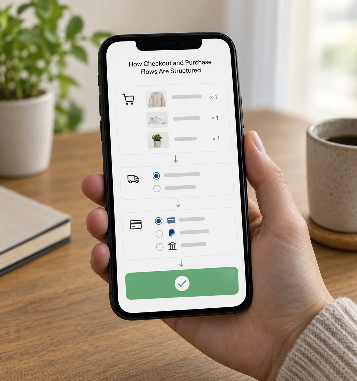
Japanese checkout is deliberately explicit. The flow runs cart, delivery details, payment method, order review, then a final confirmation screen before anything is submitted. Skipping that confirmation step or collapsing review into a single button is one of the fastest ways to lose trust, because a shopper who has just typed a delivery address and payment details wants to see the summary before committing.
Three structural conventions stand out. Delivery options are chosen as named, timed choices — for example different carriers or size-based options with a stated arrival window — rather than a single flat shipping tier. Costs and any free-delivery threshold are restated at the review step, not just in the cart. And error messages are polite and specific, telling the shopper which field was wrong and what format is expected rather than showing a generic failure.
Payment choice is part of the layout, not a detail. Credit card, mobile payment, code-based payment, bank transfer and convenience-store payment each get a named, explained option, with convenience-store payment typically letting the shopper pick a store and receive a code. For a first purchase on an unfamiliar site, the visible breadth of payment options is itself a reassurance signal.
Address entry usually starts with a postal code lookup that fills in the address automatically. It is a small implementation detail with a large usability payoff, and it is close to universal on Japanese sites because manual address entry is a known friction point.
The confirmation screen after submission is the last zone: an order number, a delivery summary, a stated delivery date range, the payment method chosen, and contact information for the order. It usually also states the operator’s name and support route, which is a deliberate closing trust cue.
How to Evaluate a Japanese Ecommerce Page
Here is a repeatable seven-step check you can run on any Japanese storefront, including your own.
- Find the primary task in five seconds. Can you point at the main navigation, the main content and the buy control without hunting? Dense pages fail this when every block has equal visual weight.
- Read the header top to bottom. Check that search, account, cart, support and delivery information are all present before you scroll. Anything missing here is a friction point later.
- Test the filters. On a category page, check the facet list, the sort options and the result count. Open a filter sheet on mobile and count the steps to apply it.
- Compare product information. On a detail page, check that price with tax, points earned, delivery estimate, availability, payment icons and the return policy are all reachable without expanding a menu.
- Verify the trust signals. Look for the operator’s company name and contact details, the return window, warranty terms, and the privacy policy. A site with none of these is a site you would not buy from.
- Resize to a phone. Load it on a real device, not a browser resize. Check the sticky buy control, the gallery, the filter sheet, the font size and whether the product name truncates.
- Trace the checkout. Follow it all the way to the confirmation screen without looking at anything else. Note every field, every unexpected error and every place a cost appears or changes.
Now apply it to a generic example. Imagine a small home goods store selling a single cast iron pan, with a clean Western-style page: hero image, three products, a short description, a simple add-to-cart button and a thin footer.
Running the checklist, the header has no delivery policy link and no support contact. The category page has no filter sidebar, only a sort dropdown. The product page shows the price without tax, no points line, and shipping cost mentioned only in a collapsed accordion. Reviews exist but sit below related products, and there is no Q&A area. On mobile there is no sticky buy control and the filter sheet takes four taps. Checkout jumps from the cart straight to a single confirm button with no order review step.
Nothing on that page is broken. That is the problem. Every gap is a small one, and together they read to a Japanese shopper as a store that has not thought past the payment form. The fix is usually unglamorous: add the zones.
When adapting a Western template, work in this order: add the reassurance blocks first, then points and tax-included pricing, then delivery estimation, then the Q&A module, then mobile sticky controls, then the confirmation screen. Each one is a contained change, and the conversion impact compounds because each one lowers a different objection.
One pattern designers notice first when they look at Japanese pages: the complaint is almost never about volume. Extra elements are easy to add and easy to justify. Missing hierarchy between blocks is the harder problem, and it is the one that actually costs conversions. Treat the extra zones as the easy fix and the structure between them as the real work.
Frequently Asked Questions
What is the most common layout for a Japanese ecommerce page?
The most common layout is a ten-zone stack: a utility header, category bar, campaign banner rail, ranking module, product grid, filter sidebar, product detail block, reassurance stack, review and Qu0026amp;A modules, and a specification-heavy footer. The page is structured to answer several shopper types at once rather than drive a single action.
How do Japanese ecommerce websites organize product categories and filters?
Categories usually run across a full-width menu bar with mega-panels on desktop, and breadcrumbs run below the header on category and product pages. Filters sit in a permanent left sidebar with price bands and checkboxes, sorting appears in a labelled row above the grid, and the result count is stated in text. On mobile the filter set moves into a full-width sheet with an apply button.
What information should a Japanese product detail page make easy to find?
Price with tax included, points earned, variant options, quantity, a delivery cost and estimated arrival date, availability, payment method icons, and the return and warranty terms should all be reachable without opening a menu. The long description, specifications and usage notes can sit in accordions further down. Reviews and a question-and-answer area usually belong above related items.
How do promotions and seasonal campaigns affect Japanese ecommerce page design?
Promotions occupy defined zones rather than spreading across the page, usually a banner rail under the category bar and a points or coupon module near the buy controls. Seasonal events change the weighting of those zones: tax-free periods add explainer blocks, gift seasons replace the homepage with gift guides, and major sales repopulate the ranking modules.
What trust signals should shoppers look for on Japanese ecommerce sites?
Look for clear delivery cost and timing, an explicit return window, warranty terms, visible customer service contact details, and the operator’s company information in the footer. Tax-included pricing, a broad payment method list including convenience-store options, security and privacy policy links, and a visible review count with a public question-and-answer thread all add confidence.
How does the checkout process usually differ from browsing on a Japanese ecommerce site?
Browsing is exploratory and the page is dense, but checkout is deliberately linear: cart, delivery details, payment method, order review, then a final confirmation screen before submission. Delivery options are named and timed rather than a flat shipping tier, costs are restated at review, address entry usually starts with a postal code lookup, and error messages are polite and specific about which field failed.
Conclusion
If you inspect one thing, look at the header. Search, support, delivery information and account controls sitting above the fold tells you almost everything about whether the rest of the page was built for Japanese shoppers.
Then work down the checklist. Navigation structure, the product decision information on the detail page, the reassurance blocks, the mobile experience with its sticky buy control, and the checkout with its order review and confirmation screen. Add the missing zones before you redesign anything visual. In 2026, the difference between a Japanese ecommerce page that converts and one that gets quietly abandoned is usually not aesthetic, it is whether the information a shopper needs to feel safe is actually there.