Japanese packaging is detailed for three overlapping reasons: the law fixes a long list of items that must appear on a pack, children are taught to read labels from the age of three, and a gift-giving culture turns presentation into part of the product. Add a convenience store shelf where roughly a hundred facings compete for one glance, and you get a package carrying far more information than the same product sold in the US.
Most explanations stop at “Japanese culture values quality,” which is true and useless. The interesting part is how much of the detail you see is legal obligation, how much is retail physics, and how much is genuinely decorative.
This guide breaks the five real drivers apart, shows you where each mandatory label item sits on a pack, and tells you what to check first when you buy something from Japan.
Table of Contents
- 1Why Japanese Packaging Is So Detailed?
- 2Why Japanese Packaging Is So Detailed in Practice
- 3How Japanese Design and Shopping Habits Shape Packaging
- 4How Gifting Culture Shapes What Gets Wrapped
- 5Why Japanese Snacks Are Individually Wrapped (and What the Glico Story Gets Wrong)
- 6Small Households, Small Portions, Smaller Packages
- 7What Japanese Packaging Communicates at a Glance
- 8How Information Design Makes Japanese Products Easier to Understand
- 9How to Read a Japanese Food Package in Five Steps
- 10Why Precision in Size, Materials, and Production Matters
- 11Does Japanese Packaging Always Mean Minimalist or Fancy?
- 12What Makes Some Japanese Packaging Look Overdesigned
- 13What to Look for When Buying Japanese Products
- 14Frequently Asked Questions
- 15Is Japanese packaging required to be detailed by law?
- 16Why do Japanese food labels sometimes look crowded?
- 17Does minimalist Japanese packaging always cost more?
- 18What do the recycling marks on Japanese packages mean?
- 19Can shoppers judge quality without understanding Japanese text?
- 20Conclusion
Why Japanese Packaging Is So Detailed?
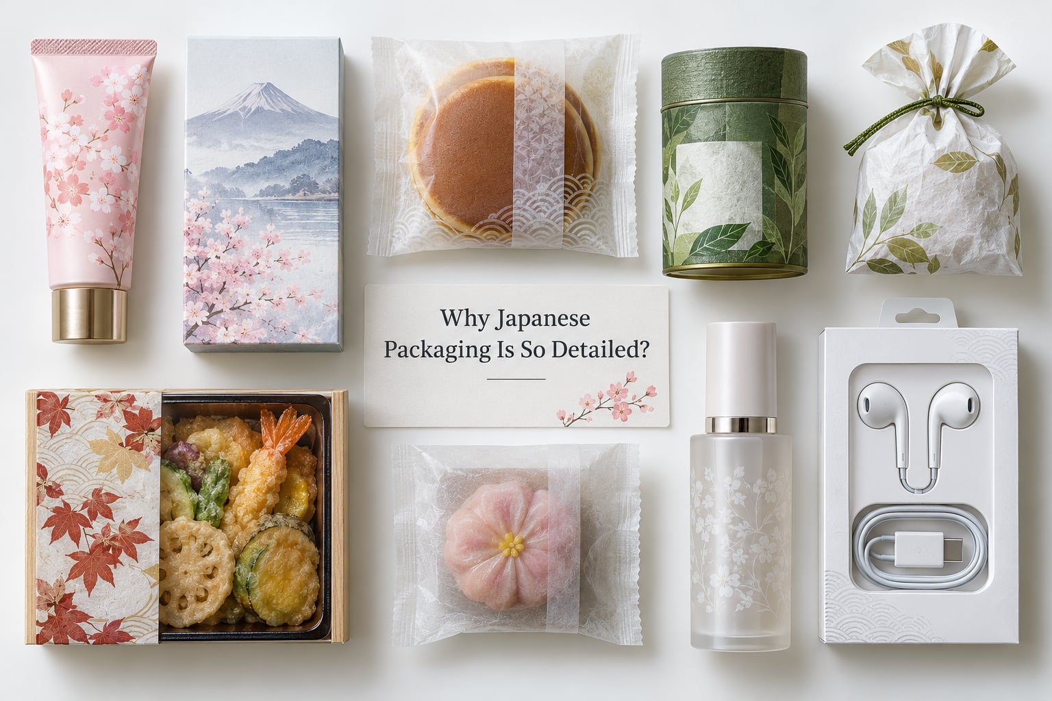
The short answer: nobody in Japan decided to be fussy. Several systems push in the same direction, and they compound.
Japanese food labelling is governed by the Food Labeling Act and the Food Sanitation Act, enforced by the Consumer Affairs Agency and the Ministry of Health, Labour and Welfare. A fixed set of items has to appear: product name, ingredient list in descending order of weight, allergens, nutrition values, net content, best-before date, country of origin, manufacturer name and address, and recycling marks. That alone explains the block of dense text on the back of a packet of rice crackers.
Separately, the Act against Unjustifiable Premiums and Misleading Representations makes it illegal for what a package shows to differ from what the buyer receives. That is the reason the illustration on a Japanese snack bag matches the snack inside almost piece for piece, which is the fact most foreign visitors remember first.
Then there is the third layer, which is cultural. Japan’s school food education programme teaches children what a label is, where the expiry date lives and why allergies matter, using food education characters called ojikochan. By the time a shopper is an adult, reading a dense panel is ordinary rather than intimidating.
| Factor | What it pushes toward | Where you see it on the pack |
|---|---|---|
| Regulatory precision | Fixed mandatory items, legal accuracy of images and prizes | Back panel text block, net content, dates, recycling marks |
| Information design | Grid alignment, typographic hierarchy, standardised pictograms | Nutrition table, allergen box, cooking instructions |
| Aesthetic restraint | Limited palettes, restrained type, seasonal colour shifts | Front face, insert cards, limited-edition variants |
| Cultural cues | Gift readiness, omiyage portioning, polite unboxing | Individual wrapping, tidy inner trays, wrapping style |
| Customer expectations | Low tolerance for damage and for disappointed buyers | Protective inserts, tamper-evident seals, careful folding |
Why Japanese Packaging Is So Detailed in Practice
Look at a convenience store bento and you get the whole picture at once. The lid carries the product name, the price, the date it must be eaten by, a list of allergens and, on some, a note about heating instructions. Underneath is a compartmentalised tray with a film seal. Nothing about that is decoration.
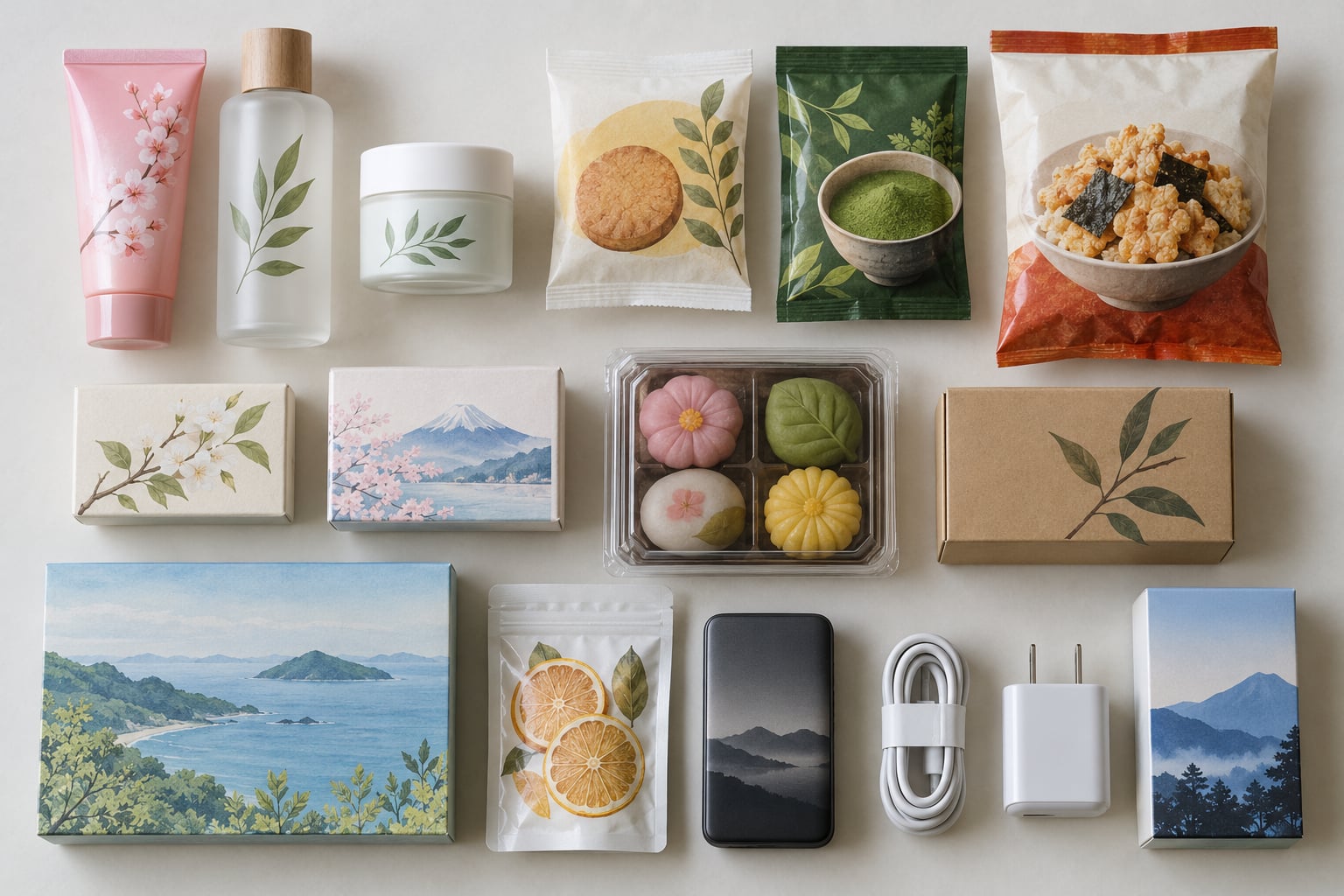
Tea packaging shows the same density in a different register: the blend name, the harvest region, the roast date, a steeping diagram with a water temperature and a timing pictogram, and the material mark for the filter bag.
Confectionery and cosmetics add a different kind of precision. A confectionery multipack often puts a count and a best-before window on each inner wrap, because the outer bag and the individual pieces do not age at the same rate. Cosmetics add an ingredient list using INCI naming, a period-after-opening symbol, and a caution line.
Electronics packaging tends to look the most technical of all, with spec sheets, serial ranges, warranty terms and regulatory compliance marks printed with machine-like consistency. It reads as detail because the law and the category both insist on it.
How Japanese Design and Shopping Habits Shape Packaging
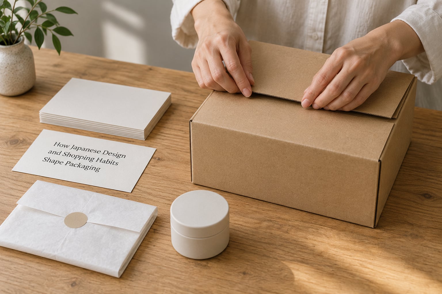
Three ideas get quoted constantly: omotenashi, the habit of anticipating a guest’s needs; shibui, restrained simplicity; and mottainai, regret at wastefulness. They are useful, but none of them is a design specification, and treating them as one big explanation for Japanese packaging is lazy.
What they do describe is a baseline expectation. A package that arrives crushed or half-open has failed before the product is even judged, because the box is treated as part of the hospitality. That pushes engineers toward tight folds, layered board and inserts that hold a shape rather than letting a bottle roll in transit.
Expectations also run toward compactness. A hand towel that takes up half a suitcase is a small discourtesy. Designers respond with vacuum-compressed shapes and flat folding, which is a lot of engineering to achieve something that looks effortless.
Alongside all that sits ordinary commercial pressure. Brands respond to consumer research, competitor launches and retailer requirements, and they iterate. The polished result is partly craft and partly a normal competitive market that simply runs on tighter tolerances.
How Gifting Culture Shapes What Gets Wrapped
Japan has several overlapping gifting systems, and each one puts pressure on the package. Omiyage are souvenirs brought back for colleagues and friends, where giving something identical to everyone is normal and therefore unremarkable. Oseibo and ochugen are the mid-year and year-end gift seasons, when corporate and family gifts are expected and the wrapping quality is judged.
That expectation explains a lot of the detail you notice. Multiple identical units are wrapped individually so the recipient can hand each one out without re-wrapping. Inner bags are sealed cleanly so a gift stays untouched until it is opened. Boxes are assembled with folds flat enough to sit neatly in a stack of other gifts, and tissue is folded rather than crumpled.
It also explains seasonal packaging. Limited-edition wrappers tied to cherry blossom season, summer festivals or year-end gift periods give a familiar product a different shelf presence, and they let a brand compete with itself for attention during a crowded week.
Why Japanese Snacks Are Individually Wrapped (and What the Glico Story Gets Wrong)
The individual wrapping of multipack snacks has a famous explanation. In 1984 and 1985, a group claiming ties to the Glico company extorted several food firms, and distributors began wrapping sweets individually to tamper-proof them. The story retold online is that this single event created the Japanese habit of individually wrapped snacks. That is a myth, and it is worth correcting because it gets the causes wrong.
Individual wrapping is much older than the 1980s, and it serves several practical purposes. Snacks are commonly shared within a household or office, so individual wraps keep the rest of the pack clean. Rice crackers and sweets are hygroscopic and go stale or soft fast once opened, so a smaller unit size extends the usable life of what is left. And for gifts, individual wrapping removes the problem of recipients having to repackage.
The Glico incident did something real, but smaller. It pushed companies toward tamper-evident sealing and sealed inner packs, which reinforced an existing habit rather than inventing it.
The cost is real too, and it draws criticism. Environmental groups have petitioned against excess plastic, and snack makers have answered with thinner films, paper-based outer sleeves on multipacks and plant-based materials in some lines. The detail is not going away, but the material is changing.
Small Households, Small Portions, Smaller Packages
Japan’s household structure has changed in ways that show up directly in pack sizes. The number of single-person households has risen sharply as the population ages and the average household shrinks, and food companies have followed with smaller bento trays, single-serving cup noodles and multipacks built around two or three people rather than a family of four.
That means more SKU variants, which means more packaging detail. Each variant needs its own barcode, its own nutrition panel, its own allergen declaration and its own best-before window. A cluttered package shelf is partly a symptom of a country full of small households.
What Japanese Packaging Communicates at a Glance
Almost every visible element on a Japanese pack is carrying information. Once you know what each one is for, the density starts making sense.
| Design element | What it communicates | Mandatory or optional |
|---|---|---|
| Product name | What the product actually is, in plain words | Mandatory |
| Ingredient list | Composition in descending order of weight | Mandatory |
| Allergen declaration | Which common allergens are present or may be present | Mandatory |
| Nutrition values | Energy, protein, fat, carbs, sodium, minerals per serving | Mandatory |
| Net content | Actual weight or count, excluding packaging | Mandatory |
| Best-before date | Quality guidance date, phrased as avinuki kigen | Mandatory on most foods |
| Country of origin | Where the product was made | Mandatory |
| Manufacturer or seller details | Company name and address for enquiries and recalls | Mandatory |
| Recycling identification mark | Material composition and disposal route | Mandatory for plastic packaging |
| Front-of-pack illustration | The contents, in a legally accurate depiction | Optional, but regulated if used |
| Mascot character | Brand personality and family appeal | Optional |
| Seasonal palette | Limited edition status and shelf differentiation | Optional |
The distinction matters for non-Japanese readers. Anything that reassures a regulator or a consumer is mandatory, and anything that builds a brand is optional. A mascot is a choice; an allergen line is not.
How Information Design Makes Japanese Products Easier to Understand
Density is not automatically good design. A crowded panel can be technically compliant and still hard to use. What Japanese packages tend to do well is hierarchy: a clear grid, a limited set of type sizes, generous margins around the text block, and pictograms that repeat information in a shape rather than a sentence.
Common techniques include aligning the ingredient list and nutrition table to the same left edge, isolating the allergen line so it stands apart from surrounding copy, and repeating a colour rule across a range so shoppers learn that blue means storage and red means a warning. Warning text tends to sit in a distinct block near the storage instructions rather than being buried in the middle of the panel.
Cooked, retort and frozen items add step-by-step diagrams, because reheating instructions that fail create a safety problem rather than an inconvenience. Cosmetics packages lean on standardised symbols, including the open-jar period-after-opening mark, so the information reads the same way across every brand.
There are trade-offs. Small sachets leave no room for good hierarchy, so the text compresses. Readability for older shoppers is a genuine issue when type shrinks to fit. And a legally accurate image of a snack takes up more of the front face than a stylised one would. Dense does not mean superior, but a lot of Japanese package design does treat information as something worth spending surface area on.
How to Read a Japanese Food Package in Five Steps
You do not need Japanese to check the useful parts. Work in this order and you can assess any imported pack.
- Check the name and the photo side by side. The image is legally regulated, so if the picture shows a strawberry filling and the pack says otherwise, the picture usually wins the argument.
- Find the date line. Look for the printed date and the label either avinuki kigen for a quality guidance date or yoko kigen for a strict expiry. Both sit near the net content in most formats.
- Read the allergen box. It is set apart from the rest of the copy and lists specific allergens under an ingredient-derived heading.
- Use the nutrition table. Japanese panels give values per serving and often per package, with sodium listed alongside carbohydrate, fat and protein.
- Find the recycling mark. The triangle-and-arrow symbol and the Japanese katakana inside it tell you which separation stream the material belongs to.
Why Precision in Size, Materials, and Production Matters
The visible side of a package gets the attention. The engineering side is where a lot of the quality actually lives, and it is invisible until something goes wrong.
Dimensional accuracy is the quiet one. Retailers run automated handling, and a tray that is a few millimetres off can misfeed. Shelf-ready packaging is designed around that tolerance: straight walls, a consistent footprint and a film or board surface that grips well on a shelf.
Print registration shows up at the fold. If the colour band or the pattern runs off the crease, the package was made for a different format and someone saved money. Consistent registration across a large print run is a simple visual check that reveals how carefully the run was managed.
Folds and seams matter for a different reason: they determine whether a box holds its shape when a bottle shifts inside it. Board weight, flute type and the way a corner is scored all change the result. Protective inserts, folded tissue and shaped trays are designed so nothing moves, which is why Japanese parcels arrive with the contents still arranged.
Dispensing systems deserve their own line. Pour spouts that reseal, tear notches that stop at the edge, peel films on yogurt cups, resealable pouches and cap mechanisms that thread correctly the first time are all small engineering problems that a designer spent time on. They are the reason a pack feels considered rather than merely printed.
Seals and tamper evidence work the same way. An inner seal or a shrink band that is visibly intact tells you the contents have not been handled. That is a functional benefit, and it happens to reinforce the trust people read into a tidy pack.
Japanese packaging machinery is also an export industry in its own right. Investment in packaging production capacity across Asia has been driven substantially by Japanese equipment makers, which means a lot of the standard for die-cutting, flexographic printing and sealing lines in the region is set by what works reliably in Japanese production lines.
Does Japanese Packaging Always Mean Minimalist or Fancy?
No, and this is the most persistent misread. Japanese packaging is not a single national style, it is a set of category conventions that pull in different directions.
Ordinary food packaging is often visually loud. Mascots, saturated colours and dense text compete hard for attention on a convenience store shelf, and a plain pack of rice in a supermarket aisle is the exception rather than the rule. Companies like Unicharm, Kao and Bandai built recognisable characters into their packaging for exactly this reason.
Beauty packaging often runs the opposite way, toward restraint and limited palettes, because the purchase is driven by texture and tone rather than by recognition from a distance. A single product line might change its packaging every season precisely because that is the visible signal of a new release.
Technology packaging is the third register, and it is dense, technical and full of specification rather than minimal. A mains adapter or a storage device puts compliance marks and spec tables on the front where a perfume bottle puts nothing at all.
Each goal produces different priorities: mass-market efficiency pushes toward cheap material and fast lines, premium presentation pushes toward board weight and print finish, giftability pushes toward presentation, durability pushes toward structure, and regulatory clarity pushes toward space on the panel. A package that looks minimal is usually minimal in one dimension and dense in another.
What Makes Some Japanese Packaging Look Overdesigned
Some of the impression comes from constraints rather than taste. Small pack formats force copy into a tight area. Long ingredient lists cannot be shortened. Multilingual labelling adds a second or third language block on export versions. Each product variant needs its own panel.
Some of it is genuinely functional: certification marks, insertion cards explaining a dosing device, tamper bands, and high-resolution printing where the pack must reproduce an accurate product image.
And some of it is brand differentiation. When several companies sell a similar product, the wrapper is one of the few surfaces where a company can be visibly different from its rival, so design gets budget.
| Convention | Japan | United States | European Union |
|---|---|---|---|
| Front-of-pack text | Common: name, price, date, key claims | Brand and imagery lead | Brand and imagery lead |
| Image accuracy | Regulated; representation must match the goods | Governed by general deception rules | Governed by general deception and consumer rules |
| Allergen labelling | Specific and prominent, separated on pack | Major allergens declared in the ingredients list | Emphasis on emphasised allergens |
| Nutrition | Per serving and per package, standardised | Serving-based, standardised format | Per 100 g and per portion, standardised |
| Date labelling | Quality guidance and strict expiry used distinctly | Best before standard | Best before plus use-by for perishables |
| Recycling marks | Material identification mark on plastic packaging | Varies by state, resin code common | Material code required |
| Characters and mascots | Common on food and household goods | Rare on food packaging | Rare on food packaging |
| Individual wrapping | Standard for multipacks and gifts | Mostly for multipacks, less common overall | Common for multipacks |
The counterpoint is worth stating plainly. Japan produces a great deal of multi-layer film, and the recycling system for it is genuinely difficult, which frustrates people trying to sort waste correctly. The shift toward thinner films and mono-material laminations is underway but slow, because the multi-layer format does a lot of the job of keeping food fresh.
What to Look for When Buying Japanese Products
Here is the practical version. When a Japanese product arrives, run these checks in order.
Registration and fold quality. Does the print line up where the box folds? Does the seam sit flat? Does the lid sit square on the base? Misalignment at a crease is the clearest sign that the pack was produced to a different specification than the one it is holding.
Seals and tamper evidence. Is the inner seal or shrink band intact and unbroken? Does the cap thread correctly without force? These tell you more about how the product was handled than the outer graphics do.
Fit of the physical design. Are the contents still in the positions the insert intended? A well-engineered pack keeps everything in place after a journey, and if items have shifted around, the internal structure was not doing its job.
Information clarity. Can you find the date, the net content and the allergens quickly, even without reading Japanese? If those three are hard to locate, the information design is weaker than the reputation suggests.
Material and disposal marks. Is there a recycling identification mark, and does the packaging match what the mark claims? A two- or three-layer laminate may still be unseparated and difficult to recycle, whatever its label says.
Claim versus specification. Read the printed specification rather than the front-of-pack impression. Visual detail and build quality tell you how a product was made and protected, but they say nothing about whether it works. Those are separate questions and the packaging usually answers only the first one.
Frequently Asked Questions
Is Japanese packaging required to be detailed by law?
Partly. Japanese food packs must carry a fixed list of items under the Food Labeling Act and the Food Sanitation Act, including the product name, ingredients in descending order, allergens, nutrition values, net content, date marking, country of origin, manufacturer details and recycling marks. The Act against Unjustifiable Premiums and Misleading Representations separately requires that representations on the pack, including illustrations and prize offers, match what the buyer actually receives.
Why do Japanese food labels sometimes look crowded?
Small pack formats leave little room, and the required content is fixed rather than optional. A short snack needs a name, ingredients, allergens, nutrition, net content, a date and manufacturer details, so type compresses. Multi-layer film wraps and sachets have curved surfaces, which reduces usable space further. The density is a format constraint working against a legal minimum, not a designer choosing clutter.
Does minimalist Japanese packaging always cost more?
Not always. Minimalist-looking packaging can be cheaper to print because fewer colours mean fewer inks and often fewer print passes. Where cost rises is in materials: heavy board, laminated film, foil pouches, custom inserts and multi-stage forming all add money, as do small production runs of a new design. Restrained graphics on a complex structure can cost more than busy graphics on a simple bag.
What do the recycling marks on Japanese packages mean?
The mark is the material identification symbol required on plastic packaging. The shape of the arrows tells you the resin family and the katakana characters inside give the specific material, with marks for polyethylene, polypropylene, PET and PETE, polystyrene, PVC and other common plastics. It identifies the material rather than guaranteeing it is recyclable, and multi-layer laminations are difficult to separate even when marked.
Can shoppers judge quality without understanding Japanese text?
To a useful degree, yes. Registration and fold quality, tamper seals, how the contents are arranged after transit, whether the lid sits square and whether the cap threads cleanly are all visible without reading anything. Text you cannot read is a real limit: allergy declarations, storage instructions and cooking directions matter, and translation tools help. Physical inspection tells you about build quality, not about how the product performs.
Conclusion
Japanese packaging is detailed because a legal minimum, a classroom habit and a crowded shelf all push the same way. The Food Labeling Act fixes what must appear, the misleading-representations rules keep the image honest, ojikochan and school food education make labels something people read fluently from childhood, and omiyage and oseibo gift traditions make presentation part of the product.
When you open something from Japan, look at four things in order: whether the print aligns at the folds, whether the contents stayed arranged, whether the seals and closures worked as designed, and whether the information you need is easy to find. Each visible detail should serve a practical, cultural or commercial purpose, and once you know which is which, the density stops looking like decoration and starts looking like a system.