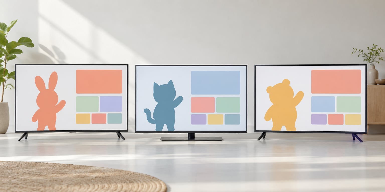
Japanese tech ads use mascots because a character is the fastest way to explain an abstract product in a format that is short, often watched on mute, and culturally allergic to hard selling. A mascot turns cloud storage or a phone plan into someone you recognise in three seconds, then keeps working on signage, apps, stickers and merchandise long after the spot ends.
I have spent a while watching Japanese tech commercials specifically, not general kawaii advertising, and the pattern is more mechanical than most explainers admit. The characters win because of what the format demands, not only because the culture likes cute things.
Table of Contents
- 1Why Japanese Tech Ads Use Mascots
- 2What the vocabulary actually means
- 3The Main Reasons Mascots Work in Japanese Tech Advertising
- 4Why Japanese Tech Ads Use Mascots in Product Explainers
- 5How Kawaii Design Connects Technology to Everyday Life
- 6Familiar Japanese Technology Mascot Campaigns
- 7How a Japanese-Style Tech Mascot Campaign Is Built
- 8Where Mascot Advertising Can Go Wrong
- 9What Global Brands Can Learn Without Copying Japan
- 10Frequently Asked Questions
- 11Why do Japanese technology advertisements use mascots?
- 12Are Japanese ads always colourful and kawaii?
- 13What is the most famous mascot in Japanese technology advertising?
- 14Does a mascot make a technology product seem less professional?
- 15How can an international brand use a Japanese mascot strategy?
- 16Conclusion
Why Japanese Tech Ads Use Mascots
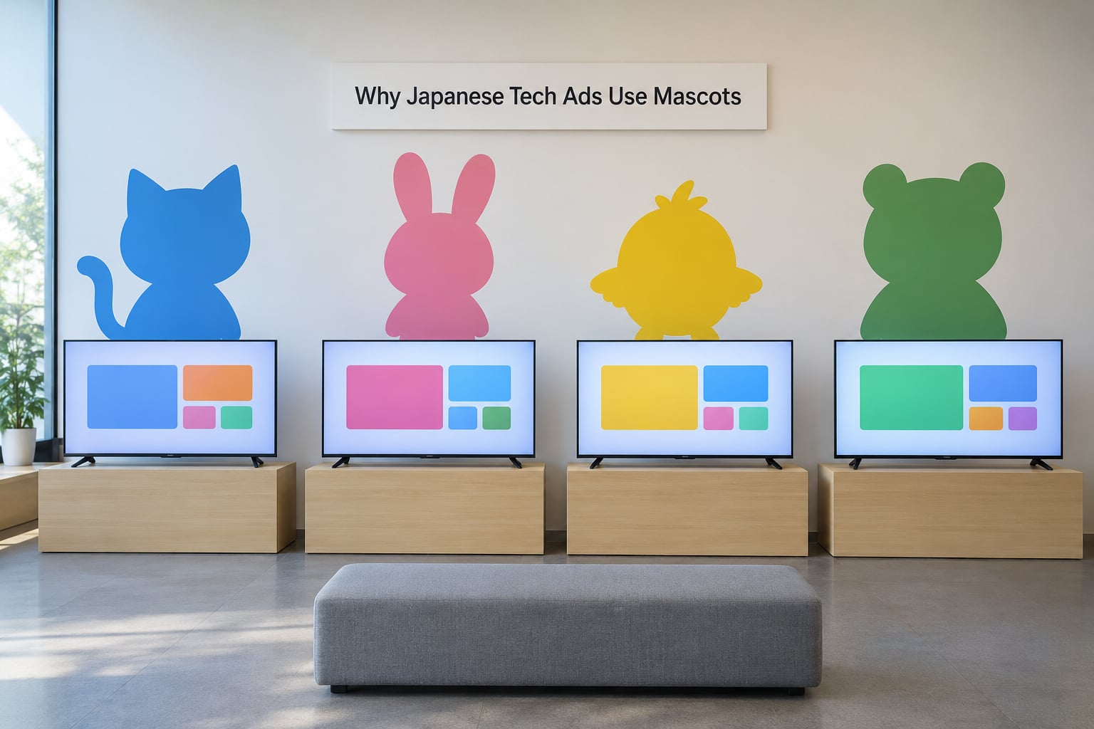
Three forces do the work. The format forces brevity: the average Japanese television commercial runs about fifteen seconds, and a large share of viewers watch with the sound off. The culture resists blunt persuasion, so a character that introduces itself rather than pitches you travels much further than a hard sell.
The medium rewards repetition. A mascot can appear on a billboard, a train wrap, an app icon and a support page without looking out of place, which means the brand pays for the design once and keeps printing it for years.
What the vocabulary actually means
English coverage tends to blur three words that Japanese marketing keeps separate, so here is the short version. The broader word is kyara, meaning any fictional character. A yuru-chara is looser: a relaxed, approachable mascot, and the official term for the regional and public-sector characters Japan has backed as local promotion tools. Kawaii is the adjective underneath much of the styling.
| Term | Meaning | What it signals in a tech ad |
|---|---|---|
| Kyara | Character | The general category any mascot belongs to |
| Yuru-chara | Relaxed, friendly mascot | A non-threatening character carrying a public or regional message |
| Kawaii | Cute, culturally layered well past cuteness | Approachability and emotional comfort |
| Yuru-kawa | Dull-cute, low-energy cute | A calm character for household and everyday services |
| Kimo-kawaii | Creepy-cute | Deliberately odd design, usually for character depth |
| Masu-komyoji | Masked persona | The physical costume worn by live performers |
The Main Reasons Mascots Work in Japanese Tech Advertising
Six reasons cover most of it, and they stack rather than compete.
- It strips complexity off an abstract product. A fibre line, a roaming network or an AI assistant has no natural image. A character does.
- It survives the fifteen-second sound-off spot. One shape, one colour, one movement reads instantly with no dialogue.
- It carries a personality instead of a pitch. The character introduces itself, so the brand is not talking at you.
- It extends into every other surface. The same artwork scales to an app, a sticker, a banner and a plush toy.
- It fits a media culture already trained on characters. Manga, anime and games give audiences a fluency Western ad buyers do not have.
- It sidesteps the foreign-brand trust gap. A cheerful, local-seeming character is a friendlier face than a foreign name on a billboard.
Here is the same list as a trade-off view, because each reason buys a specific thing.
| Mascot function | What the brand gets | Where it shows up |
|---|---|---|
| Simplifies a technical idea | Faster comprehension, fewer words needed | TV commercials, product pages |
| Provides instant recognition | Recall from a colour and shape alone | Billboards, app icons, packaging |
| Expresses brand traits | Reliability and friendliness without a spokesperson | Advertising, support material |
| Works with the sound off | Reach in a sound-off viewing environment | Television and streaming spots |
| Generates licensed income | Merchandise and collaboration revenue | Retail, events, character goods |
| Eases localisation | A local-seeming face for a global product | Regional campaigns, public signage |
Why Japanese Tech Ads Use Mascots in Product Explainers
Product explainers are where the format earns its keep. A handset ad has to show a camera, a screen and a feature list in a handful of seconds, so the character becomes the tour guide: it walks onto a screen, points at the thing that changed, and leaves before the message gets heavy.
The same logic shows up in app advertising. A banking or weather app needs to appear in a phone full of competitors, and a small expressive face on a banner reads faster than an icon alone. Guides inside apps are frequently characters too, which means the explainer keeps the same face for the entire time someone is learning the product.
What you do not often see is the character claiming to be intelligent. The mascot illustrates, it does not assert capability, which keeps the brand out of the awkward territory where a cartoon appears to make a promise the product cannot keep.
How Kawaii Design Connects Technology to Everyday Life
Kawaii usually gets translated as cute, which loses most of what it carries. Creatives interviewed by Little Black Book have pushed back on that flattening, describing kawaii as a way of signalling that something is small, harmless and safe to approach, rather than a decoration layered on a product.
The design consequences are practical. Rounded shapes read as soft rather than technical. Sparse or blank facial features keep the character neutral, which is why plenty of them look almost expressionless. Limited palettes mean the character stays recognisable at the size a train carriage or a phone screen forces it to be.
It also helps to be clear that kawaii styling is a communication choice, not a requirement for success in Japan. Corporate campaigns in Japan run stern, monochrome and technical all the time, and they do not apologise for it. The character happens to be one of the most efficient tools available for certain products, not a national style quota.
Where the style really pays off is the everyday surface. Phones, home appliances and transport services all compete for the same domestic attention, and a friendly character earns a place in a household where a spec sheet does not.
Familiar Japanese Technology Mascot Campaigns
The clearest examples are telecoms, because they sell plans and coverage, which are among the least tangible things a consumer buys.
| Brand | Mascot | Role | Status |
|---|---|---|---|
| NTT DoCoMo | DOGUHADA | Dog character carrying the brand voice across ads and merchandise | Long-running brand asset |
| SoftBank | Otosan (the white dog) | Family-friendly warmth attached to network and handset promotions | Still in regular use |
| Microsoft Japan | Yuu and Ai | Paired characters used to explain a software release | Tied to that product cycle |
| LINE | LINE FRIENDS characters | Messaging identity that extends into stickers and goods | Continuously expanded |
| Sony | Aibo | A robot dog presented as a companion rather than a machine | Evolved into a hardware line |
Two patterns run through all of them. First, the animal does a lot of the work. A dog reads instantly as friendly and loyal, which removes the need to explain the brand personality at all.
Second, the character survives the campaign. DOGUHADA and Otosan have outlived dozens of product launches, and LINE turned its cast into a merchandise business rather than retiring them at the end of a tagline.
Kumamon and Funassyi sit outside telecoms but illustrate the economics. The black bear mascot associated with Kumamoto Prefecture is widely credited with roughly 1.2 billion US dollars in reported regional economic impact, and regional mascot programmes in Japan are backed with public money. That is the opposite of the Western model, where a mascot is treated as campaign collateral.
The newer wave is chat assistants. Japanese messaging and AI services increasingly present themselves with characters, and the top video results for this query are about exactly that. The reason is straightforward: a chatbot has no body, so a face is the only way to give it one.
How a Japanese-Style Tech Mascot Campaign Is Built
Here is the process, in the order it tends to work.
- Name the communication problem. Start with what a viewer fails to understand, not with a character idea.
- Give the mascot a job. Decider, explainer or companion. Every mascot has one primary role and it should be written down.
- Set visual and verbal rules. Fix the shape, the palette, the expression and the catchphrase early, then protect them across every channel.
- Adapt rather than resize. A character that works on a train wrap needs a version that survives at app-icon size.
- Test comprehension. Show people the character without the brand name and ask what they think it does. If they guess wrong, the design is too abstract.
- Measure recall, not likes. Prompted recognition in a short window tells you whether the character is doing its job.
Step five is where most teams get it wrong. Plenty of designs look distinctive and explain nothing, because distinctiveness and clarity are different goals and only one of them gets you the sale.
Where Mascot Advertising Can Go Wrong
Six failure modes show up repeatedly, each with an obvious correction.
- No strategic purpose. The character was added for fun. Fix: write the job before the design brief.
- Visual drift. The artwork changes shape between agencies and channels. Fix: lock a style guide and refuse exceptions.
- Overconfident claims. The character promises performance the product cannot deliver. Fix: let the mascot illustrate features, never guarantee them.
- Cultural imitation. Cute styling borrowed without local understanding reads as costume. Fix: work with people who know the market rather than a reference folder.
- Character overload. Six mascots compete and none is remembered. Fix: one character, many messages.
- Confusion with the parent brand. People remember the bear, not the company behind it. Fix: lock the character to one brand and never share it across products.
There is a broader criticism worth stating plainly. Mascots can drain seriousness from a category where credibility matters, which is a fair charge against cheap mascot campaigns. It is a much weaker charge against a telecom that needs to explain coverage to someone who finds routers stressful.
What Global Brands Can Learn Without Copying Japan
The transferable part is the method, not the aesthetic. Give the character a job, lock its rules, adapt it deliberately, and measure recognition. That sequence works in any market.
What does not transfer is the drawing style. Copying rounded pastel faces without doing the underlying research produces something that looks like a Japanese ad without being built for your audience, and it fails everywhere including Japan.
Three habits are worth stealing outright. First, design for the sound-off, muted format rather than assuming people hear your jingle. Second, build the character to survive past the campaign, because the compounding value sits in year three. Third, remember where characters actually live now, which is stickers, emoji and app surfaces rather than television alone.
Readers on Reddit and Quora point out that many Japanese characters are expressionless, which looks alarming in a presentation and reads as calm in practice. That is the kind of detail you only pick up by looking at the real thing rather than a mood board.
Frequently Asked Questions
Why do Japanese technology advertisements use mascots?
Because a character explains an abstract product faster than a product shot can. Japanese television commercials run about fifteen seconds and are frequently watched with the sound off, so a recognisable shape carries the message on its own. The mascot then repeats on apps, signage, stickers and merchandise, which builds recall long after the spot ends.
Are Japanese ads always colourful and kawaii?
No. Plenty of Japanese technology campaigns run in restrained monochrome with sharp typography and no character at all, and they perform well. Kawaii styling is one communication option for products that need approachability, not a national requirement. Serious corporate and industrial advertising in Japan has never needed a cute character to be taken seriously.
What is the most famous mascot in Japanese technology advertising?
Among telecoms, NTT DoCoMo’s DOGUHADA and SoftBank’s Otosan are the two most recognised, appearing in campaigns for years rather than a single launch. In software, Microsoft’s Yuu and Ai for Windows are the best-known paired example. Sony’s Aibo took a different route by turning a robot dog mascot into an actual hardware product line.
Does a mascot make a technology product seem less professional?
It can, when the character is decorative rather than useful. The fix is to give the mascot a defined job, such as demonstrating features or guiding setup, and to keep it away from performance claims. Campaigns built that way tend to read as friendly brands rather than as companies trying too hard.
How can an international brand use a Japanese mascot strategy?
Use the method, not the artwork. Identify one product idea that needs a simpler human entry point, define what the character does, lock its visual rules, adapt it for every channel, then test whether people recognise it without the logo. Local researchers should shape the design from the start rather than translating a finished campaign.
Conclusion
Japanese tech ads use mascots because the format and the culture both reward them. Short spots watched on mute need one instantly readable image, and audiences who grew up on characters read a mascot without instruction.
Start with the smallest version of this. Pick one product concept or feature that people consistently fail to understand, and design a character whose only job is to make that one thing obvious. If it survives the comprehension test, you have something worth building on in 2026.